
Monday morning. You open your dashboard and see a sudden drop in sales, a spike in returns, or unusual transaction patterns. A traditional report shows you that something has changed, but it doesn’t help you figure out quickly enough whether it’s an error, a risk, or an opportunity.
For many SMEs, this is the real issue with data. It’s not a lack of information, but an overload of disconnected signals. Spreadsheets, charts, and KPIs already exist. What’s often missing is an interface that can immediately show you where to look and why.
This is where AI anomaly detection visualization comes into play. It’s not just a technical feature for experienced analysts. It’s a more effective way to transform complex data into actionable business insights. When artificial intelligence automatically identifies anomalies and presents them in the right context, teams stop chasing numbers and start making decisions.
Whether you manage sales, inventory, risk, compliance, or digital performance, this capability changes the pace of your work. It makes it easier to spot a problem sooner. And, in some cases, to spot an opportunity sooner.
When data deviates from the norm, you don’t always notice it in time. A sales chart may appear stable until you zoom in on the right time frame. An operational dashboard may contain the warning sign, but it can get buried among secondary metrics. That’s why many companies only recognize the problem once it has already impacted margins, customers, or operations.
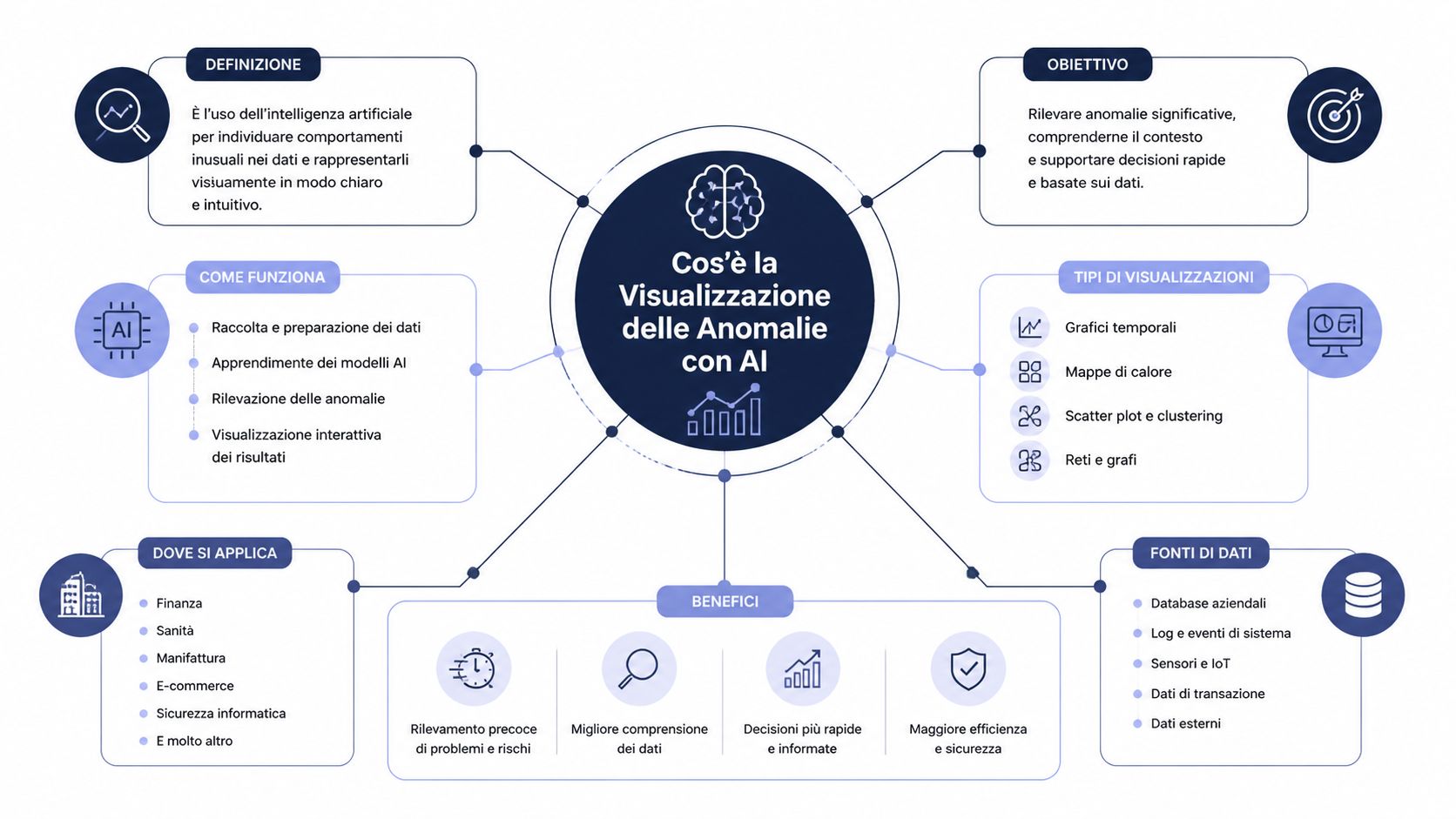
AI anomaly detection visualization addresses this very limitation. It combines three components that, on their own, are of little value. Together, they form a decision-making system.
AI means that the system learns the expected behavior of the data. It doesn't just rely on fixed rules set manually.
Anomaly detection involves identifying deviations from expected behavior. This could be a sudden drop, a spike, a change in trend, or an unusual combination of variables.
Visualization means presenting that event in a way that a team can immediately understand. Not an abstract alert, but a clear context.
Think of a control center. The AI monitors normal traffic. The detection engine flags anything that deviates from the norm. The dashboard shows you where to take action, how urgent it is, and which aspects to investigate further.
Effective visualization of anomalies does not replace human judgment. It guides it to where it really matters.
For a large company, manually investigating an anomaly is costly but feasible. For an SME, it often isn’t. Teams are small, roles overlap, and time for analysis is limited.
Here’s the key point. Intelligent visualization isn’t just about detecting anomalies. It’s about reducing the time between a signal and a decision. This is where analysis stops being a retrospective exercise and becomes an operational advantage.
The most useful form of AI anomaly detection visualization isn’t a “prettier” chart. It’s a chart that can distinguish noise from signal and highlight what deserves attention. In practice, the system establishes a baseline of normality, monitors incoming data, and flags outliers that deviate from that expected range.
In practical terms, this approach resembles a monitoring system for business KPIs.
A useful example comes from LogicMonitor. The platform uses machine learning algorithms to establish expected data patterns and display values that deviate from those ranges in real time via a dedicated graphical interface. It applies dynamic thresholds based on statistical models, eliminating reliance on static thresholds and reducing false positives by learning seasonal patterns and normal variances, as described in LogicMonitor’s anomaly visualization documentation.
This step is more important than it seems. A static threshold often leads to two opposite problems. Either it triggers too many alerts, causing the team to stop trusting them, or it triggers too few, leaving the problem unnoticed.
For an SME, the value lies not only in automation. It lies in accessibility. Academic research shows that data visualizations equipped with mass notification systems require less mental effort than those without alert systems, making them easier for non-technical professionals to adopt. The same research identifies five key characteristics for effective visualization: visibility, mass notification, information sharing, emergency management, and accessibility, as reported in the academic study published by IACIS.
This is a conclusion that many teams fail to reach on their own. ROI doesn’t stem solely from the accuracy of the model. It stems from the clarity of the interface. If the system detects an anomaly but presents it in a way that’s hard to read, the operational gain is reduced.
That’s why it’s also helpful to read a simple explanation of how machine learning algorithms work when applied to data analysis. Technology matters, but what really makes the difference is how the team uses it.
Rule of thumb: if only specialists can understand the dashboard, you don’t yet have a true decision-making interface.
On Monday morning, an SME sees revenue in line with expectations and stable traffic. At first glance, there is no cause for concern. Two hours later, unusual returns emerge in a single category, concentrated in a specific region and having started overnight. A traditional chart shows the general trend. A visualization designed to highlight anomalies pinpoints the issue that requires a decision.
A traditional dashboard provides a good overview of the past, but it often leaves the team with the most time-consuming task: figuring out which signals deserve attention right now. This limitation is particularly acute in small and medium-sized businesses, where a single person may have to oversee sales, operations, and profitability without a dedicated team of data analysts.
That is why the difference goes beyond the quality of the graphics. It comes down to how quickly an operations manager can link an anomaly to a concrete action. If the system flags an abnormal time window, an out-of-pattern category, or a region exhibiting unexpected behavior, the dashboard ceases to be merely an information panel and becomes a decision-making interface.
The IACIS study cited above links visualizations with built-in notifications to reduced mental effort. For a business, the result is clear: it reduces the time needed to identify the problem and increases the time available to assess its impact, prioritize it, and take action.
The choice of format matters, too. An overview of the most useful chart types for turning data into decisions helps explain why certain insights remain hidden in dashboards designed solely for reporting.
| Approach | How it works | Main limitation | When is it useful? |
|---|---|---|---|
| Static display | Display KPIs and historical trends | It asks the reader to interpret the significance of the signal on their own | Basic monitoring |
| Dashboard with fixed thresholds | Highlight values above a specified threshold | It does not adapt well to seasonal changes, the local context, and normal variations | Highly stable processes |
| AI Anomaly Detection Visualization | Estimate the expected behavior and highlight deviations in the graph | It requires reliable data and a consistent visual design | Dynamic environments, multi-KPI, cross-functional teams |
This highlights a strategic point that is often overlooked. Simple visualization treats all data as if it had the same operational weight. An anomaly detection system, on the other hand, introduces a hierarchy of priority. This has clear economic value for SMEs, as it reduces the cost of manual reviews and shortens the time between detection and response.
The benefit also varies depending on the role:
A dashboard that displays everything with the same visual intensity does not provide clear guidance.
For an SME, choosing the right chart affects the time it takes to diagnose an issue just as much as the model used to detect the anomaly. An ill-suited view slows down the team and obscures priorities. A well-designed view, on the other hand, transforms a technical signal into an operational decision.
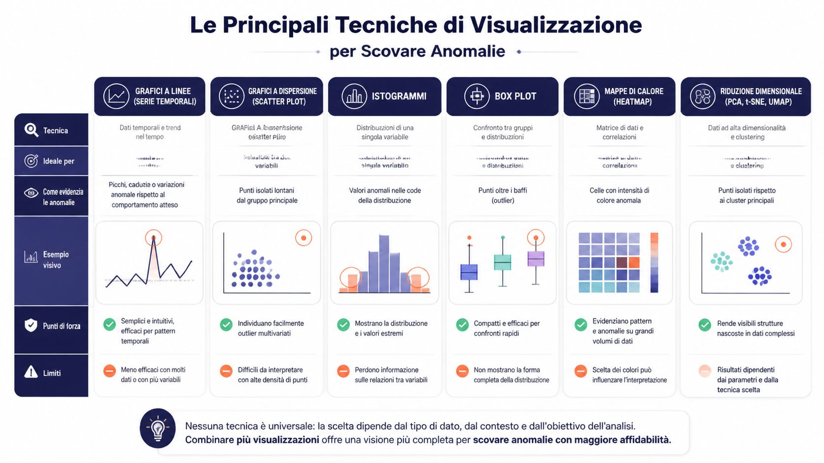
Time series remain the most useful choice when risk manifests itself as a deviation from an expected pattern. Daily sales, orders by time slot, application errors, fulfillment times, support tickets. In these cases, the value lies not only in showing the trend, but in comparing it to a range predicted by the model.
For an operations manager, this distinction matters. A spike may seem alarming in absolute terms but be normal given seasonal trends. A modest decline may seem negligible but actually indicate a deviation that requires action. Visualization reduces ambiguity by shifting the focus from the isolated number to the deviation from expected behavior.
Heatmaps work well when an anomaly arises from the intersection of two dimensions. They are often the quickest way to answer a specific managerial question: where is the problem concentrated?
Some typical examples:
The benefit for an SME is practical. Instead of opening multiple reports, the team can immediately pinpoint the critical issue and decide whether to take action in terms of sales, logistics, or quality control.
A scatter plot helps identify relationships between variables and pinpoint outliers that deviate from the general trend. If nearly all campaigns show a consistent relationship between promotional spend and conversion, data points that lie far from the central cluster warrant attention. Not because they are always a mistake, but because they signal a hypothesis worth testing. Ineffective creative, inconsistent pricing, incorrect targeting, or, in some cases, an opportunity not replicated elsewhere.
Control charts answer a different question: Is the process still under control, or is its structure changing? In production, logistics, or customer service, this distinction has a direct impact on costs and SLAs. A single outlier may require verification. A sequence of out-of-range data points or a gradual drift requires a process correction.
When anomalies are not driven by a single metric but by a combination of many variables, embedding projections become useful. These visualizations compress high-dimensional data into a readable space, where dense clusters and isolated points reveal anomalous behavior that a traditional graph would not show.
For non-technical teams, the point isn’t to understand the algorithm in detail. The point is to see if certain customers, transactions, or application events are deviating from the typical behavior of the reference group. Here, visualization becomes a decision-making tool, not a statistical exercise.
Each technique addresses a different issue. If the main cost is wasting time on false alarms, you need a visualization that clearly explains the context. If the main cost is missing a significant anomaly, you should prioritize views that immediately highlight concentrations, outliers, and isolated clusters.
| Chart Type | Perfect for... | Example of a Detectable Anomaly | Level of Complexity |
|---|---|---|---|
| Time series | Trends over time | Sudden spike in returns | Bass |
| Heatmap | Cross-category | Abnormal returns by region and product | Medium |
| Scatter plot | Relationship between two variables | Campaigns with high spend and unusual conversion rates | Medium |
| Control Chart | Process stability | Persistent deviations in operating times | Medium |
| Embedding projections | High-dimensional data | Isolated clusters in complex behaviors | High |
For teams that are rethinking their dashboard design, this guide to the essential chart types for turning data into decisions offers a useful approach: start with the decision you need to make, then choose the most appropriate visual format.
The choice of chart is an analytical decision with economic implications. It determines how quickly a team identifies a risk, prioritizes it, and takes action.
Detection is of little use if the team doesn't understand what the signal actually means. The most challenging part comes after the anomaly is flagged: interpreting the context, priorities, and possible cause.
A finance team monitors revenue and transactions on a timeline. At first glance, the curve appears to fall within a plausible range. However, when automatic anomaly detection is enabled on the chart, the system highlights both the outliers and the expected range. In an example documented by Microsoft, revenue of $5,187 recorded on August 30 is identified as an outlier because it falls outside the expected range of $2,447 to $3,423, as shown in Microsoft’s documentation on visualizing outliers in Power BI.
The key point isn’t just the off-the-charts number. It’s the fact that the system can analyze the model’s features and provide an explanation in natural language, ranking the factors by explanatory power. For the team, this means starting with a reasoned hypothesis, not a blank slate.
In retail, the issue may be different. A manager notices an unusual fluctuation in revenue for a specific combination of day, promotion, and location. The visualization highlights the anomaly within its context. The investigation no longer starts with “What happened to sales?”, but with “Which factor caused this cluster to deviate from expected behavior?”.
In this scenario, the benefit isn’t just analytical. It’s organizational. Marketing, logistics, and sales can all look at the same data and discuss it using the same visual framework.
An anomaly detection model isn't useful just because it finds something. It's useful if it finds what matters and presents it in a way that's actionable.
To evaluate this, a team should ask itself some simple questions:
Useful note: The perceived quality of a model often depends more on the explanation than on the mathematics.
In practice, many companies confuse technical accuracy with business value. The former concerns how the model performs. The latter concerns how the team reacts after seeing the results. It is this strategic measure that matters most.
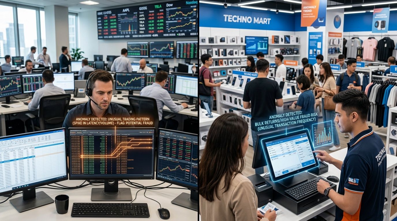
The most interesting applications emerge when the display stops being a passive control panel and becomes a hub for coordination among different people. This happens frequently in the finance and retail sectors.
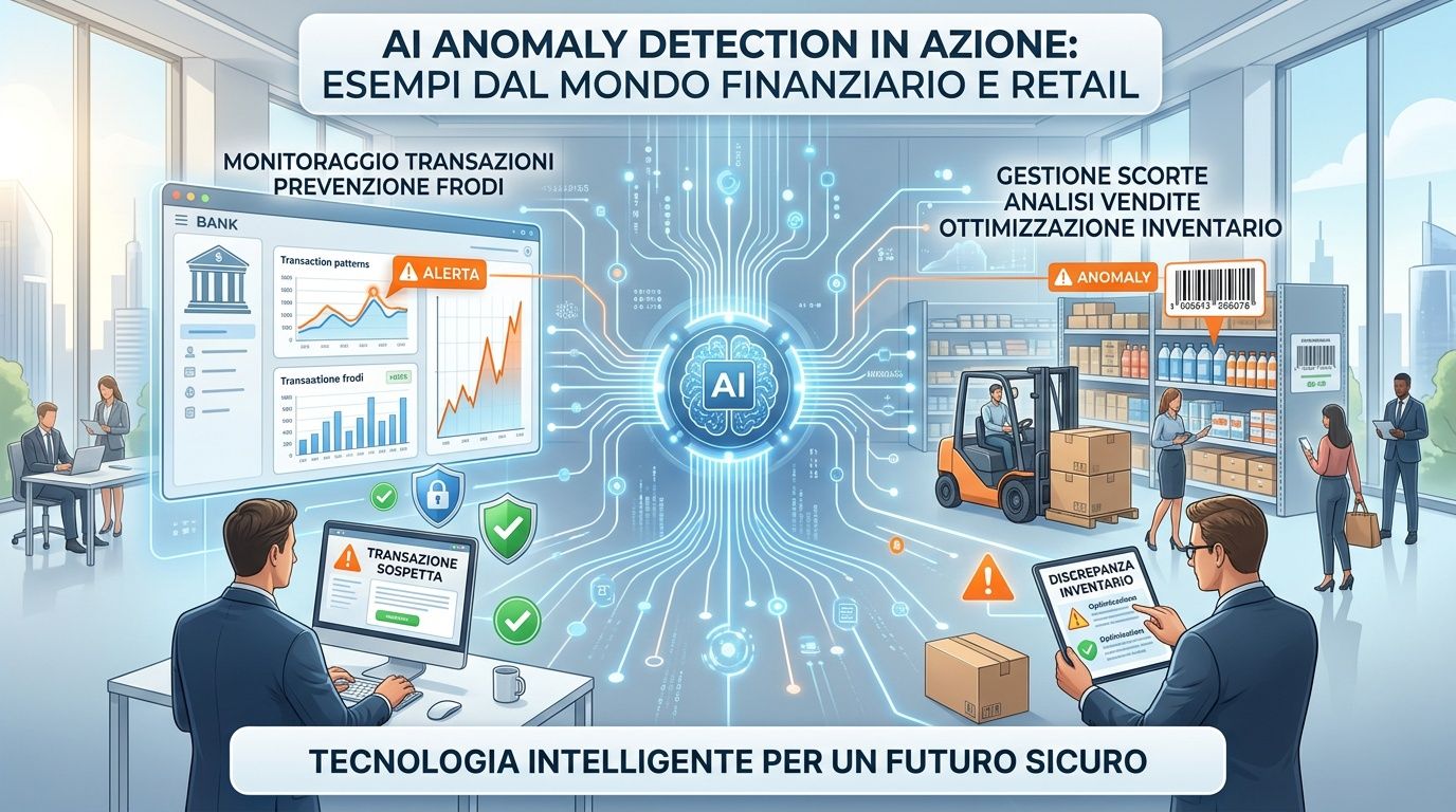
In the financial sector, anomaly visualization can help identify suspicious patterns in transaction flows and AML risk. The real value isn’t just “flagging an anomaly.” It’s showing in what sequence, across which accounts, at what times, and with what correlations the behavior deviates from the operational baseline. This allows compliance, risk, and operations teams to work from a shared understanding.
In retail and e-commerce, the logic is similar, but the operational outcome differs. A sales and inventory map can highlight a local anomaly that points to a particularly effective promotion or an impending stockout. The team doesn’t have to wait for the weekend report. It can consider reallocating inventory or revising the campaign while the situation is still unfolding.
For those working in financial services, a concrete example of a vertical application can be found in ELECTE fintech case studies. The platform is described as a solution that connects various data sources, automates data preparation, and generates visual insights for risk management, forecasting, and operational monitoring.
An action-oriented dashboard should include these elements.
This is the real game-changer. Visualization doesn’t just make data understandable—it makes it easier to coordinate.
A dashboard can be based on a sophisticated model and still fail. This happens when the design makes it harder to read rather than easier. In AI anomaly detection visualization, design isn’t just decoration. It’s part of the decision-making system.
The first rule is simple: clarity over density. If a chart contains too many metrics, too many labels, or too many colors, the outlier loses visual priority.
The second point concerns color. Red should be used sparingly. If every important element is red, nothing really stands out as urgent. Color is effective only when it follows a hierarchy.
The third factor is context. An anomaly without a baseline is just an outlier, not an insight. The user must be able to compare the observed value with the expected range or with a clear historical pattern.
A fourth rule that is often overlooked concerns interactivity.
An effective dashboard doesn't show everything you know. It shows, first and foremost, what you need to decide.
When these principles are in place, the visualization facilitates a cross-functional analysis. The manager understands the priorities. The analyst delves into the root causes. The executive sees the impact.
Business data contains much more than what is shown in a table or a static chart. It contains weak signals, early deviations, local opportunities, and risks that only become apparent when it is already too late. AI-powered anomaly detection visualization makes these signals visible sooner—and, more importantly, makes them understandable to those who need to take action.
For SMEs, this changes the way they work with analytics. You don’t need to build a team of data scientists to start identifying useful patterns. What you need is a visual representation that connects data collection, context, and decision-making. This is where technology creates real value.
If you want to move from dashboards that describe the past to dashboards that help you make decisions in the present, this is a practical direction to explore.
Want to turn your data into clearer, actionable insights? Discover ELECTE, an AI-powered data analytics platform for SMEs that connects data sources, automates reports, and makes it easier to identify patterns, risks, and opportunities.

.svg)
.svg)
.svg)