The same thing happens every week. Sales data is in the ERP system, marketing campaigns are on separate platforms, the finance team works on different spreadsheets, and customer service stores useful insights in yet another system. You need to make a quick decision, but first you have to piece everything together. This is where many companies lose time, alignment, and clarity.
A Business Intelligence Dashboard is designed specifically to solve this problem. It’s not just a screen full of charts. It’s where scattered data becomes a clear understanding of the business, operational priorities, and faster decisions. This topic is also becoming increasingly important in the marketplace. The global Business Intelligence market, which includes dashboards, is projected to reach $41.9 billion by 2030, with growth driven by self-service and AI capabilities, according to this BI market analysis.
For many SMEs, the real challenge isn’t collecting data. It’s organizing it in a meaningful way. If you’re already working on management control, forecasting, or operational coordination, you may also find this in-depth look at a tool for effective procurement useful, because it clearly demonstrates how important it is to have processes that are transparent and manageable.
In this guide, you'll learn what a business intelligence dashboard really is, how it works, what makes it effective, and how to use it in practice—without getting bogged down in unnecessary technical jargon.
Running a business today means dealing with a paradox. You have more data than ever, but often less clarity than you need at the right moment. One file shows sales, another shows margins, and yet another shows active campaigns. Meanwhile, the team is asking for simple answers: what’s working, what’s holding us back, and where to take immediate action.
A business intelligence dashboard serves to transform this chaos into a clear picture. It brings together critical information, updates it dynamically, and makes it useful for day-to-day work. It is not just a tool for analysts. It is a management tool.
A well-designed dashboard doesn't just show you more data. It shows you the data that matters, when it matters.
This is where the cultural shift lies. Instead of chasing scattered numbers, management begins to work toward a shared vision. This reduces discussions based on differing perceptions and clarifies the relationship between operational activities and results.
For a competitive SME, value isn't just about looking back at the past. It's about connecting signals, priorities, and decisions into a single, cohesive narrative.
If you were driving a car without a dashboard, you’d only know that the vehicle is moving. You wouldn’t know how fast you’re going, how much fuel is left, or whether the engine is signaling a problem. A Business Intelligence Dashboard does for a company what a dashboard does for a car. It immediately displays the metrics that help you steer the company in the right direction.
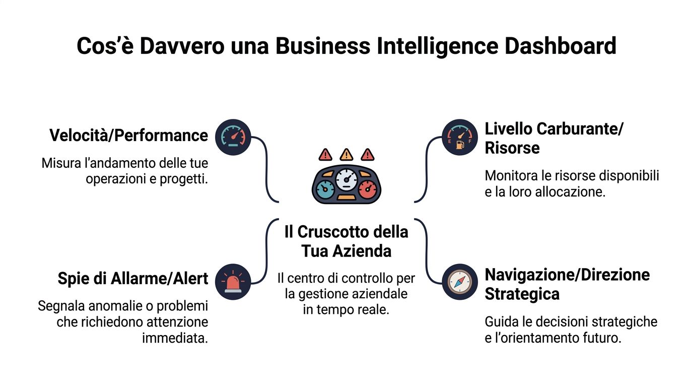
A traditional report is often static. It tells you what happened when someone exported the file, sorted it, and shared it. A dashboard, on the other hand, functions as a dynamic environment. It connects different data sources, updates relevant KPIs, and lets you filter, compare, and drill down.
According to this in-depth analysis of modern BI, a modern business intelligence dashboard consolidates KPIs from at least 10 disparate data systems in real time, allowing management to review and interpret critical data in 5 minutes every morning.
This data really drives the point home. The benefit isn't just visual—it's practical. When the key figures are already organized, you no longer waste time searching for information; instead, you spend your time deciding what to do.
A useful dashboard doesn't show everything. It shows what helps you make decisions. For example, a sales manager can see:
A marketing manager will interpret the same logic using different metrics. A CFO will look at forecasts, variances, and liquidity. The structure changes, but the principle remains the same: a single view, tailored to the role of the user.
Rule of thumb: If it takes you ten minutes to figure out where to start with a dashboard, it isn't simplifying your work. It's just shifting it.
This is also where a common misconception arises. Many people think that a dashboard means “pretty charts.” In reality, design is only useful if it supports understanding and helps set priorities. A chart can be elegant and still be useless. A good business intelligence dashboard, on the other hand, tells you right away where to look.
An effective dashboard isn't just a random collection of charts. It works when three elements work together: KPIs, data sources, and visualizations. If any one of these three is weak, the dashboard stops guiding you and starts distracting you.
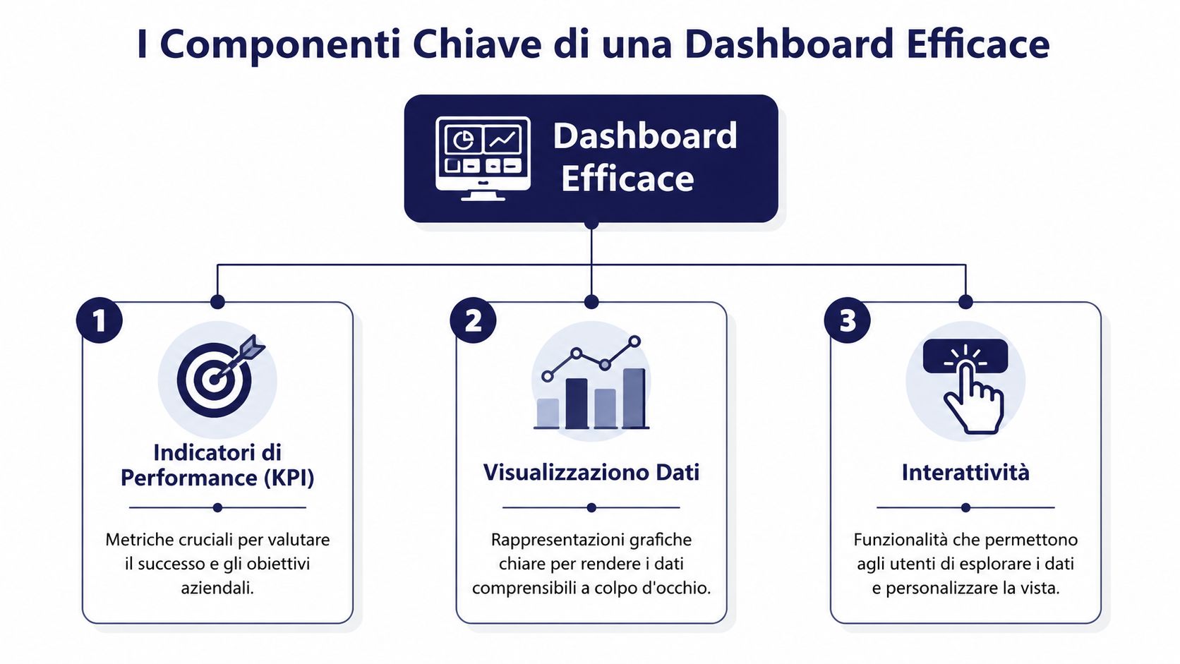
KPIs are the metrics that link data to objectives. You don’t need a lot of them. They need to be relevant. If your goal is to improve the quality of your forecast, then looking only at sales volume isn’t enough. If you want to increase operational efficiency, you also need to look at lead times, variances, and bottlenecks.
Here's a good guideline:
| Business Objective | Useful KPI | A question that is answered by |
|---|---|---|
| Business Growth | Sales by Channel | Where We're Really Growing |
| Operational efficiency | Reporting Period | How much manual work are we still doing? |
| Planning | Forecast Accuracy | How reliable are our forecasts? |
| Financial Audit | Operating Savings | Where we are reducing waste or inefficiencies |
The best KPIs have one key characteristic: they lead to action. If a number goes up or down, someone knows what to check or what to fix.
The second key factor is the quality of the data sources: CRM, ERP, marketing platforms, financial systems, and internal Excel files. A reliable dashboard depends on the ability to integrate these sources without duplication or inconsistent definitions.
Here, it becomes clear why tools like Tableau and Power BI have transformed the industry. The introduction of Tableau in 2003 and Power BI in 2014 made data visualization and self-service BI accessible to millions of non-technical users thanks to drag-and-drop interfaces and connections to hundreds of data sources, as detailed in this historical overview of BI tools.
The third pillar is visualization. Not all information should be presented in the same way.
If you want to make better choices about which visual formats are most appropriate, this guide to charts for business decisions offers concrete examples.
A dashboard works when a manager can understand what's going on without having to ask an analyst to “translate” the chart.
The most common mistake is to add visual elements simply because they're available, not because they're necessary. More visual elements don't necessarily mean greater clarity. Often, they mean less.
The right question isn't whether a dashboard is useful in theory. The question is: What difference does it make in day-to-day management? Its value becomes apparent when it reduces decision-making friction, improves oversight, and makes work less fragmented.

One of the most important questions is also one of the least frequently addressed in practical terms: How do you measure the ROI of a dashboard? The answer lies in tracking key metrics such as reduced reporting times, forecast accuracy, and operational savings, as explained in this in-depth analysis of the value of BI.
These three areas are very practical:
The key point is that the benefit doesn't depend solely on technology. It depends on everyone being focused on the same operational reality.
When a company operates without a unified view, meetings often turn into exercises in piecing things together. First, there’s a discussion about which data is correct. Only then, perhaps, do they move on to making decisions. A business intelligence dashboard reduces this friction.
For a manager, the greatest benefits tend to center on four outcomes:
Faster decisions
The information is already aggregated and easy to read.
Less manual labor
The repetitive steps of picking and repackaging are reduced.
Greater alignment between teams
, Marketing, Sales, Operations, and Finance all start from the same framework.
Greater ability to take timely action
Critical signals don't arrive at the end of the month. They arrive when it counts.
If your team spends more time preparing the numbers than discussing them, the problem isn't a lack of data. It's a lack of a framework for interpreting them.
That's why a well-designed dashboard isn't just a monitoring tool. It becomes a coordination system.
A dashboard is useful when it’s tailored to real-world work. There’s no one-size-fits-all model. Dashboards are built around the decisions that a particular industry must make every day.
An e-commerce manager starts the day by checking a few key metrics. They want to know which categories are performing well, where the shopping cart journey breaks down, and whether a promotion is generating profitable demand or just low-value traffic.
A retail dashboard can bring together the following in a single view:
Let's consider a typical scenario. A product is selling very well thanks to a social media campaign, but the margin is shrinking and inventory is depleting too quickly. Without a dashboard, these signals remain isolated. With a single view, the manager can determine whether to keep pushing, adjust the promotional budget, or protect inventory.
In retail, speed matters. But it’s even more important to determine whether growth is healthy or just superficial.
A good retail dashboard does more than just show sales volumes. It links demand, margin, and availability. This helps avoid short-sighted decisions, such as increasing spending on a product that boosts visibility but hurts profitability.
In finance, the priority is different. Here, it’s not enough to simply monitor trends. You need to identify deviations, exposures, and compliance signals. A risk analyst or compliance officer needs a clear, up-to-date, and easily verifiable overview.
A financial dashboard might include a structure like this:
| Area | What the team observes | Why it matters |
|---|---|---|
| Risk | Anomalies in Transactions and Positions | identifies cases that require further investigation |
| Forecast | Progress Against Plan | helps with planning |
| Compliance | inspections and reports | supports regulatory oversight |
| Wallet | exhibitions and gatherings | improves risk assessment |
In practice, this means the team no longer has to switch back and forth between an AML file, a portfolio report, and a forecast spreadsheet. Everything is consolidated into a single view that supports prioritization and verification.
The most useful benefit in this context is the ability to immediately distinguish between noise and genuine attention. Not every deviation requires action. But those that do must be identified immediately.
Important note: In the areas of finance and compliance, a dashboard supports the decision-making process but does not replace professional judgment, internal controls, or regulatory requirements.
Many companies get stuck before they even get started because they think they need a technical team, a long-term project, or a perfect data structure. In reality, the first useful dashboard almost always results from a simple, disciplined, and incremental approach.
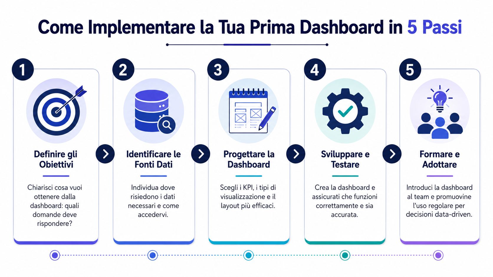
Defining Objectives
Start with a managerial question, not a technical one. You need to understand which decisions the dashboard is meant to support. For example: I want to improve sales forecasting, reduce reporting time, or better monitor promotions.
Identify KPIs and data sources
Choose a few truly critical metrics. Then identify where the data resides: ERP, CRM, internal spreadsheets, marketing platforms, finance systems. If the KPIs don’t have a shared definition, the dashboard will be confusing.
Choose the platform
. Consider ease of use, integration capabilities, and the level of automation. If you’re comparing options to better manage your business data with BI software, focus especially on how much the platform reduces manual work and how user-friendly it is for non-technical users.
Design a minimal prototype
The first version doesn't have to be complete. It just has to be useful. A clean page with a few well-organized KPIs is worth more than a feature-rich but distracting interface.
Gather feedback and iterate
Have the people who actually make decisions use the dashboard. Observe where they hesitate, what they overlook, and what they ask to be added. An effective dashboard improves with use, not in isolation.
Upon startup, certain errors occur frequently:
Start small, but start right. Your first dashboard doesn't have to be impressive. It should help someone make better decisions as early as this week.
A successful launch builds trust. And that trust is what ultimately allows the project to be expanded to other teams and processes.
The traditional dashboard primarily answers one question: What’s happening? More advanced platforms add two levels that are much more useful for an SME: why it’s happening and what requires immediate attention.
This is where the very nature of the business intelligence dashboard changes. We’re no longer just talking about visualizations and filters. We’re talking about systems that continuously analyze data, detect anomalies, and highlight what warrants a decision.
According to this analysis of the role of AI in BI, AI-based BI platforms are capable of detecting correlations in vast datasets that human analysis misses, acting as a dedicated analyst available 24/7 for SMEs.
This step is often underestimated. Many people still think of BI as a system that waits for the user. You log in, filter, compare, and export. In a more advanced model, however, it is the platform that alerts you to what has changed, what is deviating from the norm, and what patterns are emerging.
For an SME, the benefit isn't just theoretical—it's organizational. Often, there isn't a large team of data analysts available to monitor sales, risks, variances, and trends on a daily basis. A self-directed approach fills precisely this gap.
For example, an AI-powered platform can:
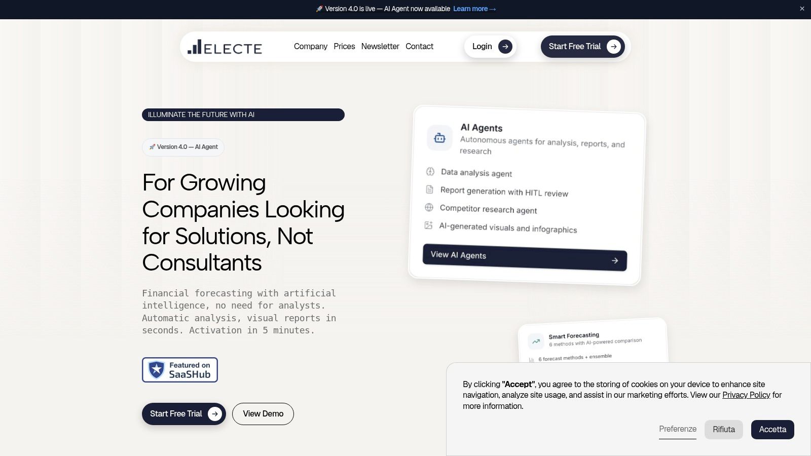
Anyone who wants to gain a practical understanding of how these environments are built and used can see how business data is visualized on ELECTE in a real-world operational context.
The most important leap forward isn't having more charts. It's having a system that processes data even when the team is busy with other tasks.
This evolution makes the dashboard less passive and more strategic. It does not replace human judgment. It enables users to take action sooner, with more context and less friction.
A well-designed business intelligence dashboard isn’t meant to “show everything.” It’s meant to make clear what truly drives the business. When it combines different sources, organizes clear KPIs, and highlights useful signals, it helps management move from chasing data to driving decisions.
If you want to get off on the right foot, keep these points in mind:
The direction is clear. The companies that make good use of data aren't the ones that collect the most numbers. They're the ones that manage to turn that data into coherent, swift, and collaborative actions.
If you want to turn your data into clearer decisions, try ELECTE, an AI-powered data analytics platform for SMEs. You can explore smart dashboards, automated insights, and predictive analytics without the complexity typically associated with enterprise projects. ILLUMINATE THE FUTURE WITH AI.

.svg)


.svg)
.svg)