

Do you need concrete answers before deciding whether to launch a new service, figuring out why a customer isn’t returning, or verifying whether an internal team is actually following a process? In these cases, creating a survey with Google can be the quickest way to gather useful data without immediately resorting to more expensive or complex tools.
The point, however, isn’t just to open Google Forms and enter a few questions. The point is to set up a data collection system that produces responses that are clear, comparable, and actionable. A hastily written form gathers scattered opinions. A well-designed form gathers insights.
This is where the real operational value lies.
Google Forms is often used as a quick tool for internal feedback, sign-ups, or simple surveys. It can do much more, however, if treated as the first step in a data pipeline. This means defining a clear objective, choosing questions that minimize ambiguity, building a coherent workflow, and preparing the data for analysis in Google Sheets or more advanced platforms.
For a marketing team, this might mean figuring out which messages generate genuine interest. For operations, it can help identify a recurring bottleneck. For HR, it can help pinpoint where the employee experience is falling short. In all these cases, the quality of the decisions depends on the quality of the questions.
Google Forms has a clear advantage. It reduces the time between hypothesis and data collection. It also has a clear limitation. If the survey structure is weak, it merely speeds up the collection of noise. That’s why it’s best to use it with a more strategic approach: not just as a simple free form, but as the foundation of a workflow that can lead to advanced analytics, useful segmentation, and AI-powered predictive models.
When someone searchesfor “how to create a Google survey,”they’re often looking for a technical guide. In reality, the problem is almost always something else. You need to make a decision, but you’re missing reliable data.
A retail manager wants to understand which promotions customers find useful. An HR team wants to know where the onboarding process is stalling. A sales representative wants to segment leads and customers without having to call everyone. In all these cases, Google Forms works—but only if the survey is designed as a decision-making tool.
Rule of thumb: Before you write a question, decide what action you will take based on the answer.
This changes everything. If you want to choose between two offers, you need comparable data. If you want to understand why a process isn’t working, you also need open-ended answers. If you want to segment your audience, you need to think about filters and the logical flow right away.
Google Forms is easy to get started with, but it shouldn’t be used haphazardly. The advantage is that you can quickly go from a draft to a well-organized collection of data. The downside is that if you ask the wrong questions, you’re just automating noise. A good survey doesn’t collect “general opinions.” It gathers useful insights to help you make better decisions.
A team launches a survey in half an hour, collects dozens of responses, and still ends up without a clear decision. This happens for one simple reason. The problem isn’t Google Forms. The problem is that the questionnaire was written as a list of random questions, not as a data collection tool.
Strategic planning is designed precisely to avoid this mistake. Before launching the survey, define the expected outcome: a product selection, a priority for action, customer segmentation, or a satisfaction check. If this step is clear, the survey ceases to be just a form and becomes a data pipeline that you can analyze effectively today in Sheets and use in much more advanced ways tomorrow, even with platforms like ELECTE.
There’s only one useful phrase: “I’ll use these answers to decide…”.
Filling it out requires some housekeeping. If you need to decide which service to promote, you’ll need to compare alternatives, assess how frequently the need arises, and identify barriers to purchase. If you need to figure out where the customer experience breaks down, you’ll need to map out the process steps, identify perceived friction points, and gather open-ended comments that explain why.
Before writing your first question, clarify three points:
This third point is often overlooked. It’s a practical mistake. If you later want to compare departments, customer segments, or satisfaction levels, you need standardized responses. If, on the other hand, you want to capture subtle cues, objections, or the customer’s actual language, you need room for open-ended responses. The structure of the question determines the quality of the future analysis.
Who answers matters just as much as what is answered.
A survey of active customers yields one set of results. The same survey completed by cold prospects or occasional users yields a different set of results, which are often incompatible. Mixing different audiences in the same data stream makes it difficult to interpret the results and nearly impossible to use that data for reliable predictive models or segmentation.
That's why it's a good idea to map out the perimeter first:
If you want a concrete example of structure, take a look at this questionnaire and see how the order, filters, and purpose affect the readability of the collected data.
The choice of format shouldn't be based on convenience. It should be based on how you plan to use the response.
Question TypeIdeal ForExample of UseMultiple ChoiceQuickly segment and compare groups“Which channel do you use most often for shopping?”CheckboxesCollect multiple responses regarding behaviors or needs“What factors influence your choice?”Linear ScaleMeasure intensity, satisfaction, or priority“How would you rate the ease of checkout?”Short AnswerCollect structured data such as role or department“What is your role in the company?”ParagraphGain qualitative insights and natural language“What would you improve about the service?”Dropdown MenuReduce noise on long lists“Select your region”
The rule of thumb is simple. Use closed-ended questions when you want to compare, filter, segment, or create clean dashboards. Use open-ended questions when you want to understand the “why,” gather useful vocabulary for marketing and product development, or conduct a more advanced text analysis.
A good survey combines both approaches. First, it measures. Then, it interprets.
A well-designed questionnaire follows a specific sequence. It doesn’t start with what you want to ask. It starts with what the respondent can answer without confusion or resistance.
In practice, an effective structure follows this order:
This approach reduces dropout rates and improves the quality of the dataset. Most importantly, it avoids a common problem with ad-hoc surveys: asking the same question to people in completely different situations.
The wording changes the result.
A vague question yields vague answers. A leading question yields unusable data. A question that suggests the answer introduces bias and undermines the survey’s credibility.
Best to avoid:
It’s best to use only one idea per question, concrete wording, and clear intervals. If you want to compare results over time or feed them into an advanced analytics system, standardization matters more than style.
Here you can see the difference between a simple form and a true data collection tool. Each question should earn its place by serving a specific purpose:
If a question does not serve one of these purposes, it should be removed.
This approach improves two things at once. It reduces noise for those compiling the data and increases the value of the dataset for those analyzing it. And this is precisely what allows us to go beyond the basic summaries provided by Google Forms. A well-designed questionnaire yields more reliable reports, clearer prioritization models, and much more useful AI analyses than a form filled with responses that are difficult to classify.
It takes just a few seconds to open Google Forms. Creating a survey that produces organized, comparable data ready for serious analysis requires a different approach.
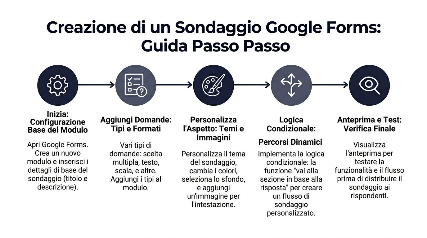
Start with a blank form and set up the questionnaire’s structure right away. The advantage of Google Forms is its speed. The downside is that it encourages you to write questions one after another without thinking about the structure. If that happens, the form will be easy to publish but difficult to analyze.
The initial settings affect both the completion rate and the quality of the final dataset.
It’s best to clarify right away:
A title like “Online Shopping Experience Feedback” works because it reduces ambiguity. Anyone who opens the form immediately understands what they’re about to do. This lowers the initial barrier to entry and improves the consistency of the responses.
Google Forms offers many different field types, but the right choice depends on how you plan to use the responses later.
Use:
This is where strategic thinking comes into play. Closed-ended questions make it easier to segment and compare data. Open-ended questions provide context but require more analysis. A good survey doesn’t rely on just one approach. It balances structured data and qualitative insights based on the decisions you’ll need to make.
If you want to see how others design simple, straightforward forms, it might be helpful to take a look at this questionnaire, which clearly illustrates how context and clarity affect the way people fill out forms.
Sections aren't just there to make the form look neater. They're there to control the flow.
In short, they help to:
A well-organized form also results in a more readable data sheet. If you later link the responses to traffic sources or digital behavior—for example, by integrating the survey with Google Analytics data for more advanced analysis—it becomes much easier to interpret the differences between segments and channels.
The "Jump to section based on response " feature is one of the most useful in Google Forms. It should be used when your audience is not homogeneous and certain questions apply only to a subset of respondents.
The benefit is clear. Respondents see a more relevant questionnaire and spend less time on irrelevant questions. This typically reduces dropout rates and improves the accuracy of responses.
A simple example:
To configure it:
Here, it’s best to be disciplined. Use conditional logic only when it truly avoids irrelevant questions or distinguishes between different cases. If you add too many conditionals haphazardly, the form becomes harder to test and more prone to errors during review.
That’s what the preview with the eye icon is for. It’s not enough to just read through the form. You need to go through it as a real user would, multiple times, with different answers.
Check:
This step has a direct impact on the value of the collected data. An error in the data flow does more than just cause inconvenience for those filling out the forms. It creates gaps, inconsistencies, and cases that are difficult to interpret later on, especially if the dataset is to be used to feed classification models or AI analyses.
Google Forms offers three main options: links, email, and embedding on a website. The choice should be based on when the person is most likely to respond.
ChannelWorks well whenMain limitationDirect linkYou want to share quickly in chats, communities, or on social mediaThe context depends almost entirely on the message accompanying the linkEmailYou have a defined list and an established relationshipThe subject line and introductory text have a significant impact on the open rateEmbed on websiteYou want to collect feedback during the digital experienceThe results depend on the page chosen and the volume of traffic
The rule of thumb is simple. Time your survey for when memories are fresh and people are most motivated to respond. That way, Google Forms stops being just a free, off-the-cuff form and becomes the first link in a more reliable data pipeline, ready for analysis that goes beyond a standard summary of responses.
The appearance of a survey does not replace the quality of the questions. However, it does influence initial trust. A plain, inconsistent, or visually confusing form conveys a lack of care. And when you’re asking for people’s time and data, that care matters.

In Google Forms, you can customize the theme using the color palette, choose fonts, and add images. It’s fine to do this, but you should do so with a very practical approach.
Better:
Worse:
If the survey is meant to collect reliable data, its design should minimize friction, not create a spectacle.
Just clicking “Send” isn’t enough. You need to decide who to send the form to, when to send it, and what to include in the message.
Three concrete examples:
The difference isn’t usually the link itself. It’s the message that goes with it. You need to explain why you’re asking for feedback, how much time it will take, and what you’ll do with the responses.
“It takes us just 3 minutes to figure out how to improve the delivery process” works better than a generic “Fill out our survey.”
A common mistake is to treat the module as an isolated entity. In reality, it should be part of your measurement system.
If, for example, you want to compare the feedback you’ve collected with users’ actual behavior on the site, it makes sense to combine the survey with browsing and conversion data. In this context, an overview of integration with Google Analytics can help you figure out how to combine self-reported signals with behavioral signals.
If you say the survey is anonymous, don’t include questions that make it identifiable without making that clear. If you’re asking for quick feedback, don’t drag it out with questions that are only included “just in case they might come in handy.”
The best distribution strategy is the one that aligns with the objective. A well-targeted campaign to the right audience is more valuable than a broad but haphazard reach.
When the first responses come in, many people stop at the automatic charts in the " Responses " tab of Google Forms. It’s a good start, but it’s not enough to make sound decisions.
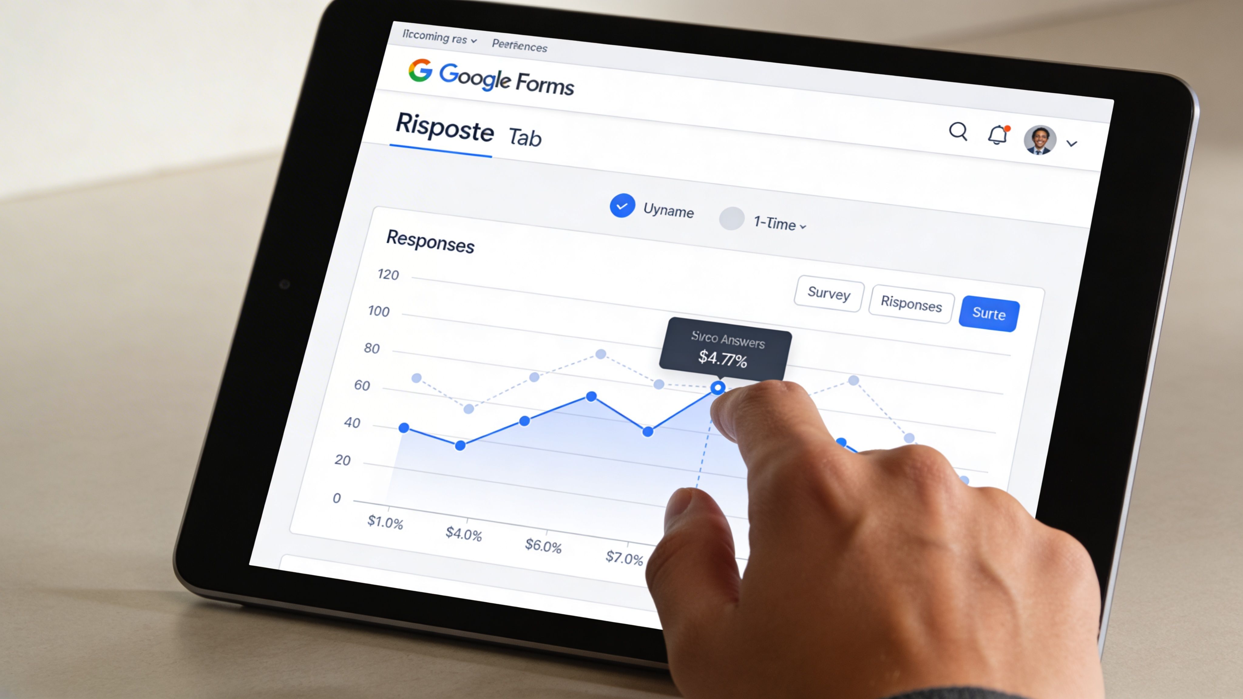
Every Google Forms survey can be linked to a Google Sheets spreadsheet that updates in real time and can contain up to 5 million cells (Google Workspace Forms). For most small and medium-sized businesses, this provides a more than solid foundation for getting the job done.
In Forms, you'll find a quick overview:
It’s useful for quickly seeing whether one option stands out, whether a question is causing confusion, or whether recurring comments are emerging. But it’s still just a descriptive level.
If you need to identify differences between segments, clean up open fields, or merge data from multiple sources, you should switch to Sheets.
You can enable the connection from the "Responses" tab using the green Google Sheets icon. From that point on, every new submission will be added to the spreadsheet in an organized manner.
This allows you to:
Automatic charts answer the question “What was selected?” The spreadsheet helps you answer the questions “By whom, under what conditions, and with what patterns?”
A useful analysis doesn't start by looking at all the columns at once. It starts with a business question.
If your issue is customer satisfaction, try reading:
If your issue is the effectiveness of an internal process:
To take this project beyond the spreadsheet, it may be helpful to learn how to set up a workflow using Google Sheets as a database.
Google Sheets is powerful, but it isn't limitless. It works well as long as the volume, complexity, and number of operations remain manageable.
Practical limitations arise when:
At that point, you shouldn’t stop using Forms. You should stop thinking that the work ends in the “Responses” tab.
When these limitations become a recurring issue, the problem isn’t the spreadsheet. It’s the fact that you’re using an exploratory tool as a permanent analytical system. Platforms like ELECTE let you import data collected via Google Forms, automate data cleaning, and generate visual reports and segmentations without having to rebuild the process in Sheets every time.
A well-designed form elicits responses. A form designed with care produces data that can actually be used to make decisions.
The difference becomes apparent later on. It’s evident in the level of detail required, the ease with which you can segment the sample, the ability to compare different time periods, and the fact that the dataset can then be used to fuel more advanced analyses, including those using AI tools.
Quality isn't just corrected in Google Sheets. It's built right into the form.
Validating responses helps reduce predictable errors. Whether you’re asking for an order number, a ZIP code, a budget range, or an email address, it’s best to enforce a consistent format. Any ambiguous response entered into the form results in wasted time spent cleaning it up, unreliable filters, and messy segmentation.
Pre-filled fields are very helpful when the survey is based on an existing contact list. If certain fields are already available—such as geographic region, account manager, or customer type—pre-filling them reduces friction and lowers the risk of manual errors. However, there is a trade-off to consider: the more fields you pre-fill, the more you need to verify that the data is still accurate at the time of submission.
The order of the questions also affects quality. Simple, context-related questions should come first. Sensitive questions or those that require more effort should come later, once the user already understands why they are answering.
This is where many mistakes occur. The survey works, and responses come in, but the group that responded doesn't match the audience you wanted to analyze.
If you send the same survey to active customers, inactive leads, former customers, and partners, the final dataset will contain data that is formally organized but methodologically mixed. At that point, the averages become misleading. Comparisons lose their meaning. Even an AI analysis, no matter how sophisticated, will yield weak insights if the sample is flawed from the start.
That’s why it’s best to treat your audience as a project variable. Decide who to include, who to exclude, which segments to keep separate, and what minimum information you need to interpret the responses in the right context.
Operational note: Before distributing the form, verify that each response can be assigned to the correct segment without the need for subsequent manual adjustments.
Adding conditional logic, optional fields, or open-ended questions only makes sense if it improves the readability of the final data.
An open-ended question, for example, can provide insights that a numerical scale cannot. It can also generate a hundred variations of the same idea, each expressed in a different way. The right choice depends on the objective. If you need to measure and compare, structure your questions. If you need to uncover unexpected problems, leave room for open-ended but focused responses.
The same applies to dynamic sections. They are useful when they prevent different users from seeing irrelevant questions. They become a problem when the data is so fragmented that it makes it difficult to compare responses across groups.
The most useful rules are simple, but they have a direct impact on the analytical value of the survey:
Visual presentation matters too, but only if it helps you interpret the results more effectively. A good starting point for choosing the right format is this guide to essential charts for turning data into decisions.
In practice, Google Forms works well as a starting point. The actual quality depends on how rigorously you define the sample, structure, and response criteria. It is this step that transforms a free survey into a reliable data source, ready not only for descriptive summaries but also for more advanced analytical models.
The real breakthrough doesn’t happen when you submit the form. It happens when you stop viewing the survey as an end in itself and start using it as input for a broader analytical system.

Google Sheets is great for exploring data. It’s not always ideal for scaling operations. As volume increases, when the team needs recurring data pulls, or when you need to integrate surveys, sales, CRM, or operational data, manual work becomes the bottleneck.
In practice, the most useful flow is linear:
At this point, the survey ceases to be merely a repository for feedback. It becomes a source of data.
When using only a spreadsheet, the team often works like this:
With an AI analytics platform, work can become more structured:
This doesn’t mean that the sheet is no longer useful. It means that the sheet is returning to its proper role: serving as an operational tool, not the permanent focus of analysis.
Most teams stop at the descriptive level. How many responded. Which option was chosen most often. Which comments appear most frequently.
It is useful, but it is not enough to guide complex decisions.
When you combine survey feedback with sales, product, or customer service data, you can start crafting more insightful questions:
The value here isn’t simply “having more dashboards.” The value lies in transforming isolated insights into actionable patterns.
The survey tells you what people say. The built-in analysis helps you see how those statements relate to actual behavior.
You don’t have to wait until you’re a large company. It’s best to do it when at least one of the following happens:
If you're looking to create a survey with Google, the end goal isn't the perfect form. It's about building a workflow where the form drives repeatable, comparable, and increasingly intelligent decisions.
Creating a form in Google is easy. Creating a Google survey that generates useful data is a more serious undertaking, but also much more interesting.
The difference lies in a few well-made choices: a clear objective, the right audience, essential questions, conditional logic when needed, and a well-organized collection in Google Sheets. Analysis that goes beyond automatic summaries.
Google Forms works because it lowers the barrier to entry. You don’t need a large budget to start gathering valuable insights from customers, employees, leads, or partners. But the competitive advantage comes later. It emerges when the data is cleaned, linked to other sources, and analyzed using a sophisticated analytical approach.
When used effectively, a survey isn’t just a minor administrative task. It serves as a bridge between what people say and the decisions a business must make. And that’s exactly where a free tool can become a real driver of growth.
If you want to turn the data you collect with Google Forms and Google Sheets into clearer insights, automated reports, and predictive analytics, check out ELECTE, an AI-powered data analytics platform designed to make analysis accessible even to teams without a complex technical infrastructure.

.svg)
.svg)
.svg)
.webp)