
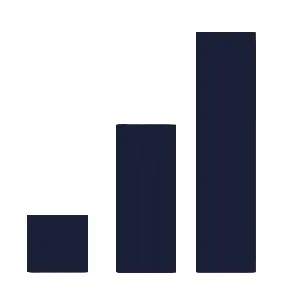
A bar chart is perhaps the most straightforward and effective tool for comparing values across different categories. Imagine a city skyline: each skyscraper represents a product, a month, or a marketing campaign, and its height reflects its success. It’s an almost instinctive way to transform complex data into crystal-clear stories and guide your business decisions.
This guide will show you how to use bar charts to answer questions that are critical to your business. You’ll learn how to choose the right type of chart for each analysis, create it without errors, and leverage AI-driven platforms to turn your data into a competitive advantage. In just a few minutes, you’ll be able to visualize performance, identify trends, and communicate your insights effectively.

Think of a bar chart not as just a simple graph, but as a universal translator for your business data. Its strength lies not in complexity, but in its extraordinary, disarming simplicity. It allows anyone—from the CEO to the junior analyst—to grasp performance at a glance.
This means making quick decisions based on concrete evidence, not just on intuition. For an SME, this immediacy is a strategic asset. Instead of getting lost in endless spreadsheets, you can immediately see the information that really matters.
The human mind processes images much faster than text. A bar chart takes advantage of this very principle to make comparisons between categories easy and intuitive. It’s almost as if the brain doesn’t even have to “read” the data, but simply absorbs it.
This ability to compare data is essential in every sector. Just think: even Eurostat’s demographic data uses bar charts to illustrate the aging of Europe’s population. For Italy, the bars reveal an almost extreme situation: as of January 1, 2024, the share of people over 65 reached 24%, compared to a mere 13% for those under 15. It is immediate visual evidence of a massive demographic challenge.
A good bar chart doesn't just display data—it tells a clear story. Its purpose is to transform analysis from a complex task into an accessible conversation with your numbers.
Instead of viewing data as a series of isolated numbers, a bar chart helps you see how they relate to one another. It’s not just a reporting tool, but a true compass for your strategic decisions. For a broader overview of the options available, check out our guide to the 10 essential chart types for your business.
Not all bar charts are created equal. Choosing the right type is the first, crucial step in turning a simple chart into an effective analysis capable of answering specific business questions. The type you choose determines the story your data will tell.
This isn't just an aesthetic choice—it's a strategic one. The wrong bar chart can obscure a crucial insight or, worse, lead to completely incorrect interpretations. Fortunately, figuring out which one to use is easier than you might think.
The vertical bar chart is the most classic and intuitive type. Categories are arranged along the horizontal axis (X-axis), while their values are represented by the height of the bars on the vertical axis (Y-axis).
It’s the perfect choice when you need to show changes over time or compare a small number of categories (fewer than 10). Its structure lends itself perfectly to tracking trends over time, such as monthly sales or leads generated each quarter.
When your category labels become long and descriptive, the vertical chart turns into a jumble of unreadable text. That’s where the horizontal bar chart comes in. By rotating the chart 90 degrees, the categories are placed on the vertical axis, leaving plenty of space for clear, readable labels.
This option is ideal for rankings and comparisons where category names are just as important as their values.
As you can see, using horizontal bars makes it easy to read the names of cities—even the longer ones—without compromising the clarity of the visual comparison.
What if you want to compare multiple data sets within each category? Aclustered bar chart is the answer. For each category, it displays a cluster of bars, each representing a different variable.
This type of chart is ideal for complex comparative analyses. It allows you, for example, to see not only total sales by region, but also how individual sales teams performed within each region.
Finally, thestacked bar chart is the perfect tool for showing how different components contribute to a total. Each bar represents a category, but is divided into colored segments that show the proportion of each subcategory.
This chart is extremely useful for understanding the breakdown of an aggregate figure. You can immediately see which product line contributes the most to total revenue or which marketing channel generates the most traffic.
A stacked bar chart shows not only "how much," but also "what it's made of." It's the best choice for analyzing the percentage composition and the parts of a whole.
Creating a bar chart that actually works isn’t just a matter of style; it’s how you turn data into a strategic asset for your business. Traditional tools like Excel require a huge amount of manual work. AI-powered platforms like ELECTE, a data analytics platform for SMEs, turn this process on its head, allowing you to go from raw data to actionable insights in just a few minutes.
Instead of wasting hours figuring out how to build the chart, you can focus on what the chart is telling you. That’s where the real value for your decision-making lies.
The first essential step is to access the data. With a platform like ELECTE, this is a breeze. You can directly connect the data sources you already use, without manual exports or complex ETL (Extract, Transform, Load) procedures.
.xlsx in an interactive dashboard.Once the data source is connected, the platform’s artificial intelligence takes care of data preparation: it corrects errors, handles missing values, and standardizes formats. Your bar chart will always be based on clean, reliable data.
Once your data is ready, creating a chart becomes a creative process. Forget about complicated formulas. The platform guides you in choosing the best visualization to answer your business question.
In ELECTE, all this comes down to a simple drag-and-drop. Want to see sales by region? Drag the "Region" field onto the category axis and the "Revenue" field onto the value axis. Done. The chart appears instantly.
The real power isn't in creating a chart, but in being able to modify it on the fly. Switch from a vertical bar chart to a horizontal one with a single click to see which one communicates the message better, or switch to a stacked chart to analyze the breakdown of revenue.
An effective graphic isn't just informative—it's also clear and consistent with your brand's image. With ELECTE easily customize every aspect of the design:
But the true value of an AI-powered platform goes beyond aesthetics. While a traditional chart shows you the past, ELECTE transforms it into a tool that looks to the future.
Practical example: You’ve just created a bar chart showing monthly sales. ELECTE doesn't stop there. Using machine learning models, it can add a sales forecast for the next three months to the chart, suggesting which products to promote to help you reach your goals.
This capability transforms a simple bar chart from a static report into a true business advisor. The goal is no longer just to visualize data, but to drive better decisions that fuel growth. If you’d like to learn more, find out how to create analytical dashboards with ELECTE.
The true power of a bar chart becomes apparent when it moves beyond a theoretical exercise and becomes a tool for solving real-world problems. This is where theory meets practice, demonstrating how different business functions can use this simple visualization to make decisions that drive growth.
The effectiveness of a chart isn't measured by its complexity, but by its ability to answer a specific question. Whether you're in sales, marketing, or finance, there's always a type of bar chart that can help you.

Imagine you're in charge of an e-commerce site. Every week, you have to decide which products to promote in order to maximize revenue. A simple vertical bar chart can be your best ally.
Let’s move on to a more complex scenario. A compliance team at a financial firm needs to monitor the risk associated with various investment portfolios. In this case, a grouped bar chart is ideal for a comparative analysis.
A marketing manager must justify every dollar spent and understand which channels deliver the best results. A 100% stacked bar chart is the ideal tool for visualizing each channel’s contribution.
Public data can also offer valuable insights. For example,in the analysis of Rome’s socioeconomic context for the 2024–2026 Budget, bar charts show that the population decline in Rome (-0.73%) is worse than the national average. For an SME, visualizing data like this is crucial for planning resources across the region. Learn more from the official source of the Metropolitan City of Rome.
You can have the most accurate data in the world, but if it’s presented incorrectly, the conclusions you draw will almost certainly be wrong. A poorly designed bar chart isn’t just unattractive to look at—it’s a source of misinformation for your team.
Avoiding these common pitfalls is a crucial step in ensuring that every chart is accurate, clear, and useful for your decision-making. Data analytics platforms such as ELECTE already incorporate these principles to guide you, but knowing them will always give you an edge.
This is the most serious and insidious mistake: not setting the vertical axis (the Y-axis) to zero. When the axis starts at a higher value, the differences between the bars are artificially exaggerated.
Consider a comparison of sales for two products: Product A (€100,000) and Product B (€110,000). If the Y-axis started at €90,000, the bar for Product B would appear twice as high, suggesting an overwhelming performance that does not actually exist.
A Y-axis that doesn't start at zero is the quickest way to distort the truth. This visual manipulation misleads the viewer, turning a small difference into a huge gap.
Another sworn enemy of clarity is "visual clutter." A graphic overloaded with unnecessary elements fails to convey its message because it distracts the viewer.
Here are the things to avoid:
Finally, even a technically flawless chart can be ineffective if presented without a clear logic. The order of the bars and the quality of the labels are crucial details.
By paying attention to these details, you’ll turn every bar chart into a powerful communication tool.
We’ve gotten to the heart of the matter. To transform a bar chart from a simple graph into a decision-making tool, you just need to follow a few simple but essential rules. Think of these points as a practical checklist to ensure that every visualization you create is clear, honest, and, above all, useful.
A chart without a purpose is just visual noise. Before opening the data file, ask yourself: What do I want to find out? Are you trying to compare sales figures? Do you want to identify the most effective marketing channel? Your question is the compass that will guide every decision.
The real strength of this chart lies in its ability to compare distinct and separate elements, such as products, regions, or campaigns. If, on the other hand, your data is continuous (such as the age distribution of your customers), a histogram is a much better choice.
As we've seen, the choice depends on the story your data is meant to tell.
Clarity always wins out. Avoid cluttering the chart: use colors sparingly, skip the 3D effects, arrange the bars in a logical order (from largest to smallest), and make sure the Y-axis always starts at zero. This last point is crucial to avoid distorting the proportions.
Your goal isn't to create a flashy chart, but one that can be understood in three seconds. In data analysis, simplicity is the ultimate form of effectiveness.
Finally, take your business to the next level. AI-powered platforms like ELECTE do more than just automate chart creation. They go a step further, helping you identify hidden trends, make accurate predictions, and receive strategic insights. This transforms a simple bar chart into a true business advisor.
Even after seeing countless examples, it’s normal to still have some doubts. Here you’ll find answers to the most common questions to help you always choose the right chart at the right time.
This is the number one source of confusion. They look similar, but they tell completely different stories.
In short: use a bar chart to compare different "things." Use a histogram to understand how "a single thing" is distributed.
The golden rule is clarity. Although there’s no magic number, try not to include more than 10–12 categories in a bar chart. If you go beyond that, the chart becomes unreadable.
When you have too many categories, you have two options:
Sure. A vertical bar chart is perfect for visualizing data over time, especially if you want to highlight the exact value for each individual period (e.g., the exact revenue for January).
However, if your main goal is to show the overall direction and continuity of the trend, a line chart is almost always the best choice. It connects the points and immediately highlights growth, decline, or seasonality.
Think of it this way: a bar chart is a series of snapshots. A line graph is a video showing how things change over time.
You’ve seen how a bar chart isn’t just a way to present numbers, but a powerful tool for decision-making. From choosing the right type of chart to avoiding common mistakes, you now have all the knowledge you need to turn your data into clear, actionable insights. Remember, the best chart is one that answers a specific business question and communicates its answer instantly.
Using platforms like ELECTE speed up this process by automating the creation of visualizations and adding a layer of predictive analytics. This way, you don’t just look to the past—you start actively shaping your company’s future.
Ready to turn your data into winning decisions? Start your free trial and see the difference for yourself.

.svg)
.svg)
.svg)