

Monday morning, 8:45 a.m. You open your laptop to prepare the weekly report and are faced with the usual scene: three files with nearly identical names—a “final” version, a “very final” version, and a “new definitive” version—sales data exported from the management system, notes from the sales team sent via email, and a colleague asking you which number is the “right” one. This is not an uncommon problem in SMEs. It’s the point at which many managers realize that the data is there, but it isn’t really working for the company yet.
This is often where spreadsheets come into play. Not as sophisticated technology, but as a basic tool that brings order, establishes a common foundation, and makes the numbers easy to understand. When used effectively, they help transition from manual, disjointed tasks to clearer, repeatable, and controllable processes.
In this article, you’ll learn the basics of how spreadsheets work, which functions are truly essential for a manager, where the limitations of traditional tools begin, and how AI automation is changing the way we work with data.
In many small and medium-sized businesses, chaos doesn’t arise because of a lack of data. It arises because each department collects data in its own way. Sales updates one file, administration uses another, operations works with an export from the ERP system, and in the end, no one is sure the numbers add up.
Spreadsheets really come into their own when you need a common language. They’re simple enough to use every day and flexible enough to handle sales, costs, inventory, planning, and reporting. That’s why they remain one of the first true indicators of a company’s data maturity.
A good spreadsheet isn't just for recording numbers. It's for turning scattered tasks into a coherent process.
When a manager begins to organize data, formulas, and controls in a consistent manner, something significant happens. Manual work decreases, errors are caught earlier, and decisions are based less on gut feelings and more on operational evidence.
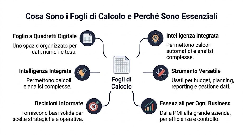
Put simply, a spreadsheet is a digital grid that can perform calculations, make comparisons, and organize data for you. If you prefer a different analogy, think of it as a set of Legos for data. Each piece has a specific place, but you can combine the pieces in many different ways.
The power of spreadsheets lies not just in storing data in a table. It lies in the fact that you can set up rules. If a row represents a sale, you can have the spreadsheet calculate the margin. If a column contains a date, you can group the entries by month. If you have a customer list, you can filter it in seconds by region, sales rep, or payment status.
For a non-technical manager, this is the key takeaway: a spreadsheet isn’t just a passive repository. It’s a space where data begins to take on meaning.
The contexts in which it is best used are very specific:
Many people get stuck when they hear words like "formula" or "function." In reality, there are only a few basic concepts.
| Element | What does that mean? | A simple example |
|---|---|---|
| Cell | The single field where you enter data | Price of a product |
| Riga | A complete record | A sale, a customer, an invoice |
| Column | A type of information | Date, quantity, area, cost |
| Formula | A calculation you wrote yourself | Price × quantity |
| Function | A pre-calculated value | SUM, AVERAGE, VLOOKUP |
The most common confusion concerns the difference between a formula and a function. A formula is a rule you create yourself. A function is a pre-built block in the program. It’s a bit like cooking from scratch versus using a pre-made ingredient.
Rule of thumb: if your team is always entering the same data and asking the same questions, you already have a good use case for improving the structure of your spreadsheet.
Why are they still essential today, in the midst of the AI era? Because they remain the operational format most closely aligned with the day-to-day work of countless companies. They are readable, editable, shareable, and easy to understand. Before truly automating processes, we almost always have to start here: organizing rows, columns, names, rules, and responsibilities.
A manager doesn’t need to know hundreds of metrics. They need to know the ones that provide quick answers to real questions. Who is buying the most? Where are we losing margin? Which customers are behind on payments? Which products are underperforming?

Pivot tables are one of the most useful tools out there. They take a long table and summarize it without you having to rewrite everything. For example, from a list of daily sales, you can get the totals by month, by sales rep, or by region in just a few clicks.
Let’s say we have the following columns: date, customer, product, quantity, revenue. With a pivot table, you can:
The reason they work so well is simple. They let you change your perspective on the data without altering the original file.
One of the most common problems in a business is having data scattered across different files. Sales data is in one file, customer information in another, and price lists in a third. This is where VLOOKUP—or similar tools in newer versions—comes in.
Let’s say you have the customer ID in the sales records but not the company name. With a search function, you can automatically retrieve it from another table. The same applies to product category, assigned sales rep, discount tier, or geographic area.
Errors here often stem from two causes:
That's why this function shouldn't be viewed as some kind of magic. It only works well when the underlying data is organized.
Not everyone is good at reading a spreadsheet. Many managers spot problems more quickly when the spreadsheet “speaks” visually. Conditional formatting does exactly that. It colors cells, highlights anomalies, flags discrepancies, and brings priorities to light that would otherwise remain hidden.
Some very concrete examples:
Then there are the charts. A simple chart, if done well, conveys more information than a table full of numbers. Use lines to show trends over time, bars to compare categories, and pie charts only when there are few categories and they’re very clear.
If it takes ten minutes in a meeting to explain what you’re showing, the problem isn’t the data. It’s the way you’re presenting it.
For a more structured approach to reports and visualizations, it may also be helpful to examine how dedicated platforms organize their analytical and data presentation features, as outlined in the overview of analytics and reporting capabilities.
If I had to choose just a few features to master, I’d start with these:
You don’t need to learn everything at once. You need to link each function to a specific decision. When you do that, spreadsheets stop being an administrative chore and become a management tool.
Theory is helpful, but spreadsheets really prove their worth when applied to day-to-day tasks. Let’s look at three typical scenarios in an SME. You don’t need complex models. What you need is a clear structure and a few well-applied rules.
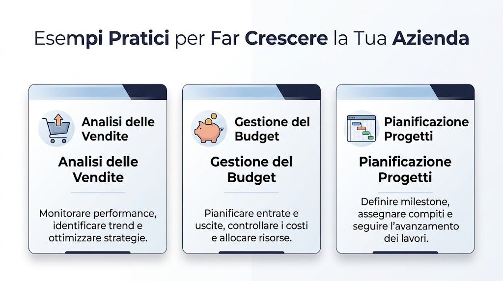
A small business receives orders through e-commerce, sales agents, and phone calls. The data exists, but each channel saves it in a different format. The first step isn’t to create a sophisticated dashboard. It’s to create a single table with standard columns: date, channel, customer, product, quantity, revenue, and cost.
From here, you can build a basic dashboard with three blocks:
A manager can add a pivot table to aggregate revenue and a line chart to track trends. If sales are down in certain areas, the file helps identify whether the decline is due to a specific channel, a product, or a single key customer.
A practical example of a starting template can be helpful. That’s why it’s worth consulting a guided example Excel spreadsheet template to organize business data, especially if you’re starting with files that aren’t yet standardized.
Companies that sell technical products often realize too late that a product is nearly out of stock. Sales continues to sell it, operations only notices at the last minute, and urgent requests are sent to suppliers. A well-designed spreadsheet can greatly reduce this problem.
Just a few columns are enough:
| Product code | Description | Current inventory | Minimum threshold | Supplier | Reorder time |
|---|
Using a simple formula, you can create a "stock status" column that indicates whether the level is normal, needs monitoring, or is critical. With conditional formatting, the team can immediately see what requires action.
Here, the value isn't just operational. It's managerial. Decision-makers can finally distinguish between perception and the actual state of the warehouse.
A well-designed spreadsheet doesn’t eliminate operational work. It eliminates the unnecessary work that hides the real problem.
If you want to take it a step further, you can cross-reference inventory levels with average sales to identify which items are likely to run out first. Even without advanced models, this alone changes the way you plan purchases and promotions.
In many small and medium-sized businesses, the budget starts out as a “temporary” file and then becomes the standard reference for months on end. The problem is that often no one knows which formulas are correct anymore, who changed what, or where the current version is located.
A more solid structure starts with three separate sheets:
This way, management can see not only how much has been spent, but also where the company is deviating from the plan. If costs for a particular line item rise, the file shows it immediately. If a cost center is under control, there’s no need to monitor it every week.
To make the budget easier to read, it’s a good idea to include a brief summary using color-coded indicators. Green if the deviation is minor, yellow if it requires attention, and red if it needs further investigation. It’s not just about aesthetics; it’s a way of prioritizing.
Spreadsheets aren’t just for sales and administration. In specific industries, they can support highly specialized analyses. In finance, for example, the advanced use of spreadsheets for risk assessment remains underutilized. A statistic cited in a technical article hosted by Stadata reports that 42% of medium-sized companies in the sector do not use advanced spreadsheets to model critical aspects such as rounded corners in structural profiles, while Cerved reports a 22% increase in accidents related to angular errors. The reference is available in the document on the effects of rounded corners in cold-formed thin-walled profiles.
This example is specific to a particular industry, but the principle applies to everyone. When data becomes technical, sensitive, or compliance-related, a makeshift spreadsheet is no longer sufficient. You need structure, control, and clarity regarding the model used.
Spreadsheets are great for getting started. The problem arises when the company grows and continues to use them as if they were sufficient for any scenario. At that point, you’re no longer managing data. You’re managing files.

There are some easy-to-spot signs:
This limit is not merely theoretical. According to the section on IronCalc, traditional software such as Excel experiences significant slowdowns beyond 100,000 rows, while modern open-source tools with a parallel computing engine can handle files with over 1 million rows, with processing times reduced by 40–60% and a memory footprint 70% smaller than that of Apache OpenOffice Calc, as described in the overview of IronCalc and the handling of massive datasets.
When your report updates slowly, the problem isn’t just technical. It becomes a decision-making issue. You show up to meetings with outdated numbers, waste time checking cells, and the team stops trusting the tool.
Many companies react negatively to this transition. They think that spreadsheets “don’t work anymore.” In reality, they worked well in the early stages. It’s the complexity of the business that has changed.
To figure out if you’re close to taking the next step, take an honest look at yourself. If you spend more time:
So the bottleneck isn't the team. It's the workflow architecture.
For those considering more structured processes, it may be helpful to compare the approach of traditional spreadsheets with tools designed for financial planning and control—such as management control software—especially when reporting begins to involve multiple departments and sources.
A warning sign not to be ignored: if the file has become the focus of the work rather than a tool to support it, it’s time to revamp the process.
At this stage, many SMEs are looking for solutions that retain the familiarity of tabular reporting while automating the collection, updating, and creation of views. A good starting point is to see how a report builder works to automate reports and dashboards, rather than rebuilding everything from scratch each time.
A reliable spreadsheet isn’t the result of complex formulas. It’s the result of good habits. If the team follows a few simple rules, the data becomes easier to check, update, and share.
The first best practice is to keep raw data separate from reports. The file where you import or paste data should not be the same one where you create charts, comments, and summaries for management. When you mix everything together, it’s easy to break formulas or delete important fields.
Other very useful rules:
The second best practice concerns data entry quality. If multiple people are filling out the form, use data validation and drop-down menus. This will help reduce discrepancies in data entry and inconsistent categorization.
This issue is more relevant than it seems. Even in technical fields such as surveying, the use of automation in spreadsheets remains limited. Data from ISTAT 2025 indicates that only 28% of Italian SMEs with 10–49 employees use AI tools for data analysis, while 65% of surveyors in Lombardy report a concrete need for support with repetitive tasks such as angle conversions, as shown in the video reference on automation and surveying calculations in spreadsheets.
This finding isn't just about the layout. It illustrates a broader lesson. Many companies use spreadsheets, but few actually design them to be automated.
A basic checklist can help:
A well-organized file is faster to use today and much easier to automate tomorrow.
The next evolution of spreadsheets isn’t just about more sophisticated functions. It’s about changing the way you interact with data. Instead of memorizing syntax, nested formulas, and technical steps, you start asking questions in natural language.

This transformation is already evident in tools such as Genspark AI Sheets. According to the platform’s documentation, the integration of AI enables the use of natural language commands, resulting in a 90% reduction in human errors in tests on Italian workflows and the ability to respond to complex queries in less than 2 seconds, automating tasks that traditionally result in a 30% loss of time spent on debugging, as described in the article on Genspark AI Sheets and smart spreadsheets.
For a manager, the value is immediate. Instead of manually building multiple steps, you can get straight to the business questions: “Which regions are slowing down?”, “Which product line has the weakest margin?”, “Which customers are showing anomalies?”
This also changes the profile of the people who can make good use of data. You don’t need to be an expert in formulas to gain useful insights. You just need to ask the right questions.
Spreadsheets are becoming less like an advanced calculator and more like an analytical assistant.
Once you’ve gotten past the initial visual impression, it’s worth taking a look at an example of how assisted analysis is presented in practice:
This is where the most important step in the evolution of data comes into play. At first, you use a spreadsheet to record and organize data. Then you use it to compare and summarize. Finally, with AI, you begin to delegate parts of the analysis itself.
The cultural shift is this: you’re no longer just asking, “How much have we sold?” You start asking, “What’s changing?”, “What might happen?”, and “What’s the best decision to make right now?” It’s the difference between looking in a rearview mirror and having a GPS that warns you in advance.
For many small and medium-sized businesses, the most realistic approach isn’t to abandon spreadsheets right away. It’s to use them as a structured foundation, then connect the data to systems that automate data cleaning, analysis, forecasting, and reporting. When this transition is done right, the team continues to work using familiar processes but stops wasting hours on repetitive tasks.
If you really want to improve the way you use spreadsheets, start with small but concrete steps:
Spreadsheets remain an excellent starting point. They help organize information, ensure data consistency, and make analyses more accessible—analyses that would otherwise be scattered across files and departments. But as the volume of data grows, decisions become more frequent, and the team’s time becomes more limited, a spreadsheet alone is no longer enough.
The most effective approach isn’t to make files more complicated. It’s to evolve the way data is collected, analyzed, and turned into insights. That’s where a more modern strategy makes a difference.
If you want to turn your scattered data into clear insights, automated reports, and predictive analytics, find out how ELECTE can help you make the leap from manual management to AI-powered decision-making.

.svg)
.svg)
.svg)