

Line charts in Excel are an essential tool for anyone who works with data. They transform columns of numbers into a visual story, immediately highlighting trends, patterns, and anomalies that would otherwise remain hidden. Would you agree that a quick glance is often more powerful than hours spent poring over a table? In this guide, we’ll show you how to master line charts so you can make faster, more informed decisions.
You’ll learn not only how to create clear visualizations, but also how to prepare data flawlessly and use advanced techniques to uncover deeper insights. Whether you need to track sales, analyze production, or present a report to your team, line charts will become your most powerful tool.
A good line graph isn’t just a diagram—it’s a story. It tells you whether a marketing campaign was successful, how production levels fluctuate, or how sales have trended month by month. For small and medium-sized businesses, where every decision must be quick and precise, this visual clarity is essential.
Imagine a manufacturing company analyzing production data. In a massive spreadsheet, seasonal demand spikes can go unnoticed. A simple line chart, however, highlights them immediately. It was precisely thanks to this insight that one of our clients was able to reorganize its warehouse in advance, cutting storage costsby 8%. Adopting a data-driven approach means exactly this: transforming data into decisions that generate value.
The image below shows a classic example: a line graph comparing the sales of two products over time.

It’s clear at a glance that “Product B” has outperformed “Product A” since March. This is key information for adjusting marketing strategies and inventory management.
Despite their power, many companies do not make full use of line charts. We know that in Italy, about 67% of SMEs use Excel for their analyses, but only 32% go so far as to create time series charts to study trends. That’s a missed opportunity. To understand which visualizations can truly make a difference, check out our guide on the 10 essential chart types for turning data into decisions.
ELECTE, an AI-powered data analytics platform for SMEs, was created specifically to fill this gap. It allows you to upload raw data and automatically generate not only charts but also accurate forecasts that guide your future strategies.
This automation transforms analysis from a manual, time-consuming task into a genuine competitive advantage. Even if you lack technical expertise, you can predict inventory shortages or sales spikes with a single click.
A powerful chart always starts with clean, well-organized data. This step, which many people tend to underestimate, is actually the real secret to creating line charts in Excel that not only look professional but also tell a clear, unambiguous story. The quality of your visualization depends directly on the quality of your source data.
The ideal structure is simple and logical. Each column should represent a distinct variable. Typically, the first column contains the time series (days, months, years), while the subsequent columns contain the numerical values you want to analyze, such as units sold or revenue.
Imagine you need to track the monthly sales of two products, "Product A" and "Product B." To help Excel quickly understand what you want to do, the best data structure is as follows:
A layout like this is a godsend for Excel. It allows the program to immediately identify the X-axis (the months) and the two data series (product sales) to be plotted as separate lines on the chart. Nothing more, nothing less.
To make this concept even clearer, here’s a direct comparison between a structure that causes problems and one that will make your life easier.
As you can see, organizing your data properly from the start saves you a lot of trouble later on.
A messy dataset inevitably results in an illegible chart. Before creating the chart, always check these three critical points:
A little effort in preparing your data can save you a lot of headaches during the analysis phase. Spending five minutes cleaning up your spreadsheet can save you hours of frustration and misinterpretations.
For those who frequently work with data exported from other systems, data cleaning is an almost daily task. If you’d like to learn more about this, check out our essential guide to working with CSV files in Excel, where you’ll find tips for cleaning up your datasets in just a few minutes.
Once your data is clean and well-organized, you’re ready to take action: turn that table of numbers into a clear and powerful visual story. Creating a basic line chart in Excel takes just a few clicks, but the real magic—the difference between a chart that’s merely accurate and one that truly communicates—lies in customization.
The first step is to select the data range you’ve prepared. A quick tip: make sure to include not only the numbers but also the column headers (such as “Month,” “Product A”). Now, simply go to the Insert tab and, in the Charts group, click the line chart icon. Excel immediately offers you several options, ranging from the classic clean chart to one with markers.
A chart without context is useless. As soon as Excel generates it, your priority should be to make it immediately understandable. Start by double-clicking the title and replacing the generic text with a clear description, such as "Quarterly Sales Trends: Product A vs. Product B."
Next, move on to the axes. Make sure the vertical axis (Y-axis) has a clear label (“Units Sold” or “Revenue in €”) and that the horizontal axis (X-axis) correctly shows the timeline. A chart with the right labels is like a well-made map: it guides the viewer’s eye exactly where you want it to go.
This simple process, which transforms raw data into a chart ready for analysis, is perfectly summarized here.
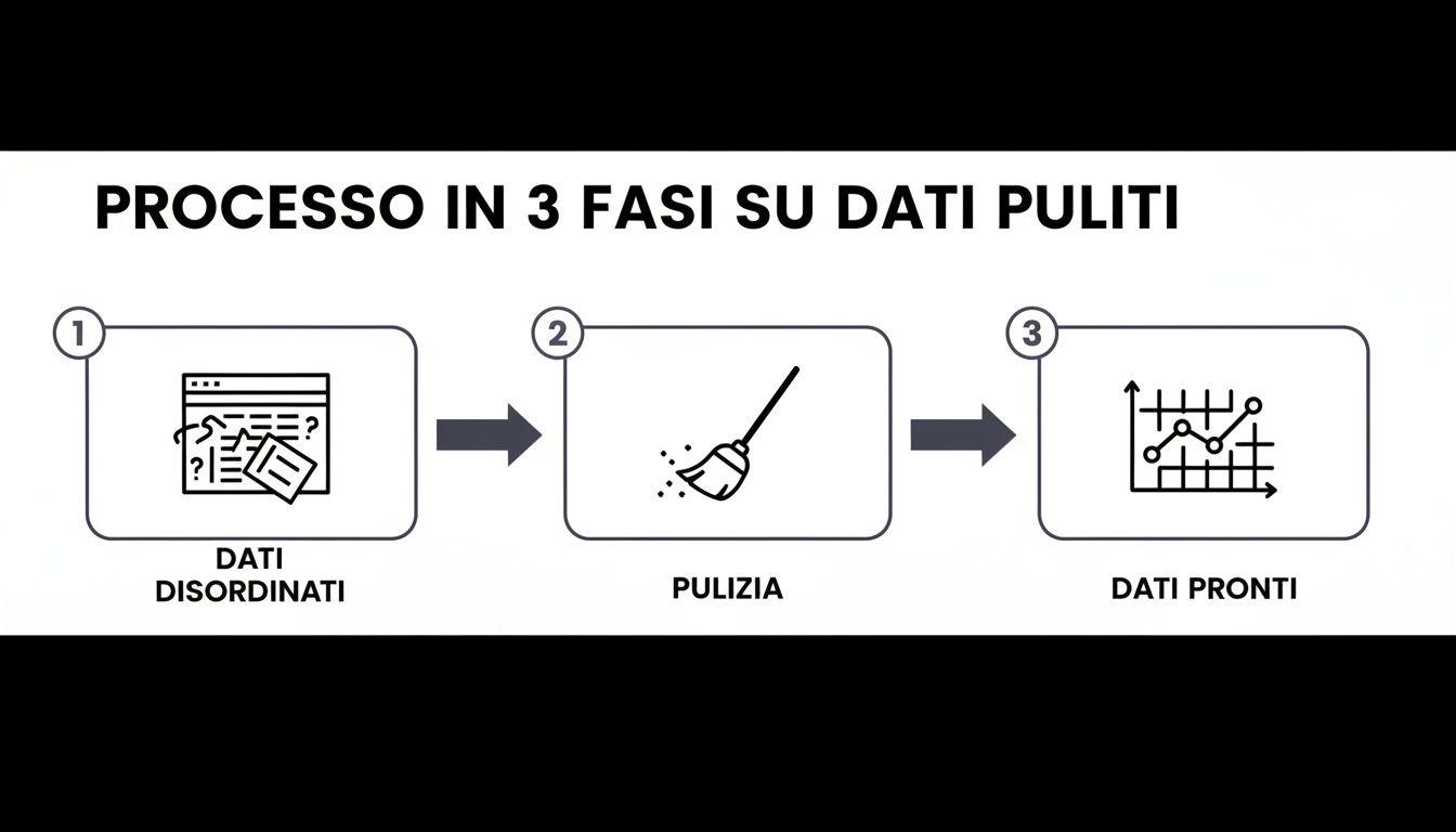
This diagram highlights a fundamental concept: data cleaning isn’t a tedious task, but rather the essential bridge between a cluttered spreadsheet and clear, visual insights.
A line chart with markers is the ideal choice when you want to highlight specific points in your data series. Markers are small symbols (circles, squares, triangles) that appear at each point along the line, making it easy to associate a value with a specific date.
This isn’t just an aesthetic choice, but a strategic decision. In the retail sector, for example, Excel line charts have become a key tool for optimizing promotion management. By selecting data such as “Quarter” and “Units” and choosing “Insert > Line with Markers,” a store can see at a glance a 35% spike on Black Friday . This simple visualization allows for better stock calibration for the following year, reducing unsold inventory by up to 22%. Yet, despite the fact that 71% of Italian retailers use Excel, only 28% regularly use line charts, often due to a perception of excessive complexity. For a complete overview, you can explore the different types of charts available in Office.
Customization isn’t just a cosmetic detail—it’s an integral part of the analysis. The right colors, labels, and styles transform a simple chart into a decision-making tool that conveys its message instantly.
Never underestimate the power of color. Use a color palette that aligns with your brand identity, or assign high-contrast colors to distinguish between different data sets. This will drastically improve readability. For a comprehensive guide on how to create effective visualizations, check out our guide on how to create a chart in Excel.
Once you’ve mastered the basics, it’s time to take your Excel line charts to the next level. It’s no longer just about creating simple visualizations, but about building true analytical tools capable of revealing deep insights and supporting complex decisions. This is where your data begins to tell a richer, more multifaceted story.
Going beyond the basic settings allows you to compare different metrics, identify trends that aren’t immediately apparent, and make your analyses fully dynamic. It’s not just about aesthetics; it’s about adding layers of information that would otherwise be lost.

One of the most common challenges is comparing two sets of data with completely different units of measurement or orders of magnitude. Imagine you want to show the trend in revenue (in thousands of euros) and the number of units sold (in hundreds) on the same chart. If you use a single vertical axis, the line representing units sold would appear flat, almost nonexistent, overwhelmed by the scale of the revenue data.
This is wherethe secondary axis comes into play. This feature allows you to add a second Y-axis on the right side of the graph, each with its own scale.
You'll immediately see the graph change, with both lines clearly visible and finally comparable. This is a fundamental technique in any financial or marketing analysis.
Raw data is often "noisy," full of daily or weekly peaks and troughs that can obscure the underlying trend. To look beyond this noise, Excel offers two powerful tools:
For those working in financial services, for example, Excel line charts are part of their daily routine. Adding a moving average can smooth out data volatility by as much as 20%, revealing underlying trends that would otherwise be invisible. A survey revealed that 75% of analysts prefer to use multiple lines with clear legends to distinguish categories such as "High" and "Medium" risks, precisely because of their immediate readability. To learn more, check out these Excel analysis techniques.
The goal here isn't to manipulate the data, but to interpret it more effectively. A trend line or a moving average helps you separate the signal from the noise, focusing your attention on what really matters for your business strategy.
The final professional touch is to free yourself once and for all from manually updating charts. If your chart is linked to a simple range of cells, every time you add new data (such as sales for the following month), you have to go back to the chart and edit the data source manually. It’s a tedious task and a classic source of errors.
The solution is very simple: convert your data range into a Excel spreadsheet formatted. Just select the data and press the shortcut Ctrl + T. At this point, when you create a line chart based on a table, it becomes dynamic. Every time you add a new row of data to the bottom of the table, The chart will update automatically to include it. This simple step transforms your spreadsheet into an interactive, real-time dashboard.
A chart can be technically flawless yet convey a completely wrong message. Creating line charts in Excel isn’t just a technical exercise; it’s an act of communication, and as such, it requires honesty. A small error—whether intentional or not—can distort the perception of the data and lead to poor business decisions.
Your goal is to become a trusted data storyteller. To achieve this, you need to learn to recognize and avoid the most common pitfalls that make a visualization misleading. Mastering these principles will not only make your analyses clearer, but it will also strengthen your credibility.
The most common—and perhaps the most insidious—mistake is to set the vertical (Y) axis to start at a value other than zero without a valid reason. This technique is often used to “dramatize” changes by visually exaggerating fluctuations. A modest 2% increase can appear to be a dramatic spike if the axis starts at a value just below the series’ minimum.
The golden rule: unless there is a specific, stated reason to focus on a narrow range (and the reason must always be explained), the Y-axis should always start at zero. This ensures that the visual proportions accurately reflect the numerical ones.
Maintaining the integrity of the axis is the first step toward an accurate representation. This allows readers of the graph to grasp the true extent of the variations without being misled.
It’s tempting to cram as many data sets as possible into a single chart, but the result is almost always unreadable. A chart with too many lines crossing and overlapping—the infamous “spaghetti chart”—only creates confusion and makes it impossible to distinguish individual trends.
To avoid getting caught up in this chaos, follow these simple guidelines:
If you really need to compare more than five data series, the best solution is almost always to split the analysis across multiple charts or group the data into logical categories.
A good graphic speaks for itself. Before you consider your work finished, do a final check using this checklist to make sure your message comes across loud and clear.
By following these tips, you’ll turn your charts from simple drawings into powerful analytical tools.
Line charts in Excel are fantastic tools for making sense of the past. But what happens when you need to look to the future? When the focus shifts to predictive analytics, you may find that Excel alone is no longer enough.
Managing large volumes of historical data to turn them into reliable forecasts requires a level of analysis that goes beyond the standard features of a spreadsheet. It is a task that demands time and specific statistical expertise.
This is exactly where AI-powered data analytics platforms like ELECTE, designed for SMEs looking to take their business to the next level. These systems do more than just create a chart: they automate the entire analysis process.
Imagine never having to manually export data again. A platform like ELECTE connects directly to your data sources, whether they’re ERP, CRM, or other management systems. Once the data is connected, the AI doesn’t just display it—it interprets it to generate actionable insights.
Let’s take a retail company that needs to optimize its inventory. Instead of spending days analyzing past sales in Excel, it can let the platform do it automatically, uncovering patterns that would be invisible to the naked eye.
One of our e-commerce clients used ELECTE to analyze three years of sales data. The platform predicted demand for the following quarter with 95% accuracy—a result that would be nearly impossible to achieve manually using Excel without a team of data scientists.
Please note, this doesn’t mean you should stop using Excel. It means supplementing it with more powerful tools for strategic tasks.
Excel is still ideal for on-the-fly analysis and day-to-day reporting. But when the questions get more complex—"What will happen next month?" or "What factor is really driving our sales?"—you need something more.
Adopting these platforms allows you to shift from reactive analysis—which looks to the past—to proactive analysis—which shapes the future. This way, your Excel skills aren’t wasted; instead, they become the foundation upon which to build large-scale strategic decisions, supported by accurate forecasts generated in just a few minutes.
Here’s what you should take away from this guide to creating effective line charts in Excel:
Mastering line charts in Excel means turning numbers into a powerful tool for decision-making. You’ve seen how to prepare data, create clear visualizations, and use advanced techniques to uncover insights that would otherwise remain hidden. Remember that every chart tells a story: it’s your job to make that story clear, honest, and easy to understand.
Now you have the foundation to create charts that not only depict the past but also help you shape the future. But if you want to take it a step further and turn your analyses into automated strategic forecasts, it’s time to explore more powerful tools.
Ready to turn your data into a competitive advantage? Try ELECTE and discover how our AI-powered data analytics platform can help you make better decisions in just a few clicks.

.svg)
.svg)
.svg)


.webp)