You already have a Python script that cleans up a CSV file, calculates KPIs, and maybe even generates a chart. The problem arises right after that. How do you get it into the hands of the people who need to make decisions but never open a terminal?
This is where a GUI adds value to your work. A “Load Data” button, a menu for selecting the time period, a readable table, and a chart updated in real time transform a technical analysis into a practical tool. In an Italian context, this matters a great deal: Tkinter has been the standard library for GUI development in Python since 1998, and in 2023, 68% of Italian Python developers on GitHub and Stack Overflow used it for prototypes, driven by the demand for rapid analytical tools for SMEs. Its simplicity also allows for a 40–50% reduction in development time compared to Java Swing (reference).
If you're learning GUI development with Python, the good news is that you don't have to start with a complex app. All you need to do is build an interface that connects input, data logic, and clear output. From there, you can move on to more polished dashboards, team-ready solutions, and integrations with analytics platforms.
A terminal script works well when you're the one using it. But as soon as the audience shifts to a marketing manager, a finance colleague, or senior management, the terminal stops being an interface and becomes a barrier.
Decision-makers don’t want to have to remember command-line arguments, file paths, or Python dependencies. They want to select a dataset, click “Analyze,” and see clear results. If you don’t provide this step, the risk isn’t just technical—it’s organizational. The analysis remains limited to those who know how to code.
A well-designed GUI reduces friction in three practical ways:
A good interface doesn't make the model smarter. It makes the insights more usable.
This changes how your work is perceived. A script is often seen as a personal tool. A desktop application, even a small one, is treated as a business asset. In an SME, this difference is significant, because the value lies not only in accurate analysis, but in the ability to ensure it is used consistently.
When you turn a script into a GUI, you’re not just adding “windows and buttons.” You’re creating a bridge between data processing and decision-making.
Think of common examples:
A script answers the question, “Does it work?”
A GUI answers the question, “Will anyone actually use it?”
If you’re working on a GUI with Python, here’s the key point to remember: the interface isn’t just a cosmetic extra. It’s the layer that makes your analysis accessible, reproducible, and shareable. In short, it’s what allows the data to leave the notebook and reach the decision-makers’ desks.
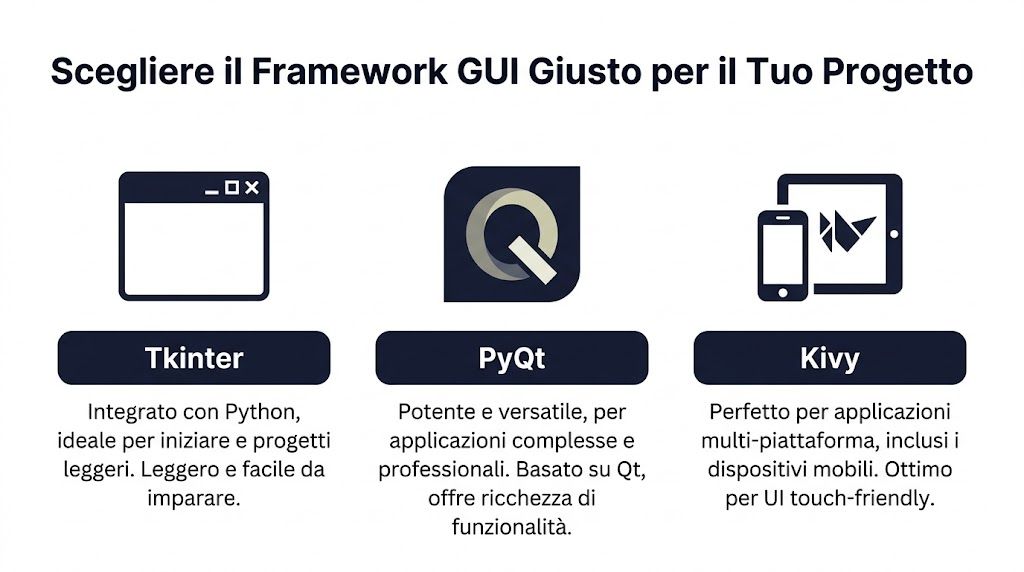
Don’t choose a framework based on trends. Choose it based on the type of app you need to build, the time you have, and who will be using it every day.
For many internal projects, the choice really comes down to three options: Tkinter, PyQt, and Kivy. They are not equivalent. They each have different strengths and also involve very real trade-offs.
Before you decide, ask yourself:
Who will use the app
? If the end user is an internal, non-technical staff member, ease of use matters more than the elegance of the framework.
How much will the project grow?
A KPI calculator and a dashboard with multiple panels have different requirements.
Where is *
* supposed to run? Just Windows desktops? MacOS too? Does it need a touch-optimized UI?
| Framework | Learning Curve | Ideal Use Case | License |
|---|---|---|---|
| Tkinter | Low | Internal tools, prototypes, lightweight apps for simple data entry and reporting | Included with Python |
| PyQt | Average | Professional dashboards, complex desktop applications, visual analytics | Check the license terms before commercial use |
| Kivy | Average | Cross-platform apps and touch-friendly interfaces | Check the terms of the selected project and its dependencies |
Tkinter is the simplest choice when you need to get started quickly. It’s built into Python, offers essential widgets, and forces you to focus on the user flow before worrying about aesthetics.
Works well for:
The advantage is practical: you can get started right away without having to set up an additional ecosystem. The limitation becomes apparent when the app becomes very complex visually or needs to handle rich interactions.
PyQt is a game-changer. Since 2005, with the introduction of PyQt and wxPython, Python-based GUI development has accounted for 45% of desktop projects in the Italian IT sector by 2024, and PyQt offers 30% better performance than Tkinter in complex applications (according to Codefinity).
For an SME, this boils down to a simple question: should the app look like a real software product? If the answer is yes, PyQt is worth considering.
Rule of thumb: if you need to display multiple views, filters, charts, and coordinated updates in the same window, PyQt is almost always more convenient than Tkinter.
PyQt is suitable for:
It requires more discipline. Layout, signals, slots, and packaging are aspects that need to be thoroughly understood. But the end result is closer to a commercial application.
Kivy comes into play when the desktop isn't enough. If you're envisioning an app that can also be used on tablets or touchscreens, Kivy takes a different approach than the other two frameworks.
It's a sensible choice for:
The trade-off is that the interface’s appearance and design don’t adhere to the traditional desktop model as closely as PyQt does. If your target audience is an administrative office using Windows PCs, it’s often not the first choice.
To make a decision without getting bogged down in minor details, use this shortcut:
The right framework isn't necessarily the most powerful one. It's the one that gets your application up and running without slowing you down unnecessarily.
Monday morning. The marketing team needs to figure out in just a few minutes which campaigns are actually generating profit, but the ROI calculation is still tracked in an Excel spreadsheet that’s been edited by different people. In cases like this, you don’t need a complex platform. You need a small, reliable tool that gathers two numbers, applies a clear rule, and returns a consistent result.

Tkinter is ideal for this first step. It lets you turn a Python script into an interface that even non-programmers can use without having to open a terminal. For an initial data project, the real benefit is this: you take a calculation out of the notebook and make it available to decision-makers.
Let's create an ROI calculator with a simple structure:
This is a realistic use case. Marketing managers, sales representatives, and junior analysts often perform this check to evaluate campaigns, promotions, or channels. If the calculation is done manually, there is a risk that different people will use different formulas. A simple GUI reduces errors and makes the process repeatable.
import tkinter as tkfrom tkinter import ttk, messageboxdef calcola_roi():try:costo = float(entry_costo.get())ricavo = float(entry_ricavo.get())if costo <= 0:messagebox.showerror("Errore", "Il costo deve essere maggiore di zero.")returnroi = ((ricavo - costo) / costo) * 100risultato_var.set(f"ROI: {roi:.2f}%")except ValueError:messagebox.showerror("Errore", "Inserisci solo valori numerici validi.")root = tk.Tk()root.title("Calcolatore ROI")root.geometry("380x220")root.resizable(False, False)frame = ttk.Frame(root, padding=20)frame.pack(fill="both", expand=True)ttk.Label(frame, text="Costo marketing").grid(row=0, column=0, sticky="w", pady=5)entry_costo = ttk.Entry(frame, width=25)entry_costo.grid(row=0, column=1, pady=5)ttk.Label(frame, text="Ricavo generato").grid(row=1, column=0, sticky="w", pady=5)entry_ricavo = ttk.Entry(frame, width=25)entry_ricavo.grid(row=1, column=1, pady=5)ttk.Button(frame, text="Calcola ROI", command=calcola_roi).grid(row=2, column=0, columnspan=2, pady=15)risultato_var = tk.StringVar(value="ROI: in attesa")ttk.Label(frame, textvariable=risultato_var, font=("Arial", 12, "bold")).grid(row=3, column=0, columnspan=2, pady=10)root.mainloop()root = tk.Tk() initializes the main window. title, geometry and resizable define the context of use. In an internal tool, the clarity of the interface matters far more than the visual appeal.
The block with ttk.Frame, ttk.Label and ttk.Entry builds the module. I've seen many early Tkinter applications start with basic widgets and quickly become messy. ttk helps keep things looking cleaner with minimal effort.
The part that really matters is calculate_roi(). Here, the GUI stops being just a window and becomes a data application:
Validation is about the product, not just the code. If a colleague enters text instead of a number or a cost of zero, the problem isn’t technical. The problem is that this data could lead to a wrong decision.
For this first app, it’s best to keep the scope narrow. Just one calculation. Just one screen. Just one operational goal.
This approach helps avoid three common mistakes:
The test of success is simple. A department manager should be able to open the app, enter the campaign data, and get a reliable result in just a few seconds.
Once you've verified that it works as intended, you can extend the tool in a structured way:
If you want to choose visualizations that are suitable for these outputs, the guide on useful chart types for turning data into actionable decisions can help you avoid decorative charts and focus on those that truly clarify the results.
A Python GUI project is valuable when it bridges the gap between analysis and decision-making. Tkinter excels at this first step of the process. It takes a script written by a programmer and transforms it into a tool that can be used by marketing, operations, or finance teams.
From there, the next step is more interesting than the button itself. When you standardize inputs and logic, you prepare cleaner data for dashboards, reports, and AI insights. That’s when a small GUI stops being a technical exercise and becomes a bridge to a platform like ELECTE, where that same data can be presented in a way that’s easy for management to understand and used to make better decisions.
When the data no longer fits on a single screen, Tkinter starts to feel limited. A dashboard with filters, tables, gauges, and charts requires a more robust framework. This is where PyQt becomes the natural choice.
A good dashboard doesn’t cram everything onto the screen. It organizes the user’s focus. The filter should be where the user expects to find it. The main chart should update when the time period changes. KPIs should remain easy to read without opening unnecessary secondary windows.
Here is a practical layout for a sales dashboard:
PyQt makes it easy to build this layout using layouts such as QVBoxLayout, QHBoxLayout and QGridLayout.
The snippet below shows a small dashboard with a filter by quarter and a label that updates when the selection changes.
import sysfrom PyQt5.QtWidgets import (QApplication, QWidget, QVBoxLayout, QHBoxLayout,QLabel, QComboBox, QTableWidget, QTableWidgetItem)from PyQt5.QtCore import Qtclass DashboardVendite(QWidget):def __init__(self):super().__init__()self.setWindowTitle("Dashboard Vendite")self.resize(700, 450)layout_principale = QVBoxLayout()barra_filtri = QHBoxLayout()self.combo_trimestre = QComboBox()self.combo_trimestre.addItems(["Q1", "Q2", "Q3", "Q4"])self.combo_trimestre.currentTextChanged.connect(self.aggiorna_dashboard)barra_filtri.addWidget(QLabel("Trimestre"))barra_filtri.addWidget(self.combo_trimestre)barra_filtri.addStretch()self.label_kpi = QLabel("Fatturato selezionato: dati Q1")self.label_kpi.setAlignment(Qt.AlignLeft)self.tabella = QTableWidget(3, 2)self.tabella.setHorizontalHeaderLabels(["Prodotto", "Vendite"])self.popola_tabella("Q1")layout_principale.addLayout(barra_filtri)layout_principale.addWidget(self.label_kpi)layout_principale.addWidget(self.tabella)self.setLayout(layout_principale)def aggiorna_dashboard(self, trimestre):self.label_kpi.setText(f"Fatturato selezionato: dati {trimestre}")self.popola_tabella(trimestre)def popola_tabella(self, trimestre):dati = {"Q1": [("A", "120"), ("B", "95"), ("C", "110")],"Q2": [("A", "140"), ("B", "88"), ("C", "130")],"Q3": [("A", "150"), ("B", "100"), ("C", "125")],"Q4": [("A", "170"), ("B", "115"), ("C", "160")]}righe = dati[trimestre]for riga, (prodotto, vendite) in enumerate(righe):self.tabella.setItem(riga, 0, QTableWidgetItem(prodotto))self.tabella.setItem(riga, 1, QTableWidgetItem(vendite))app = QApplication(sys.argv)finestra = DashboardVendite()finestra.show()sys.exit(app.exec_())The key concept here is the link between the event and the update. currentTextChanged.connect(self.update_dashboard) It creates an immediate response from the interface to a user action. This is one of the reasons why PyQt is well-suited for dashboards.
In real-world apps, after tables and KPIs, there’s usually a Matplotlib chart integrated into the layout. The logic is simple:
The interface doesn't need to do all the calculations. It just needs to coordinate the components and present the result in the right way.
In a good dashboard, every filter has a predictable effect. If the user changes a selection and doesn’t understand what has been updated, the UI is already failing.
For a broader perspective on how to structure analytics dashboards, it is helpful to compare this approach with ELECTE guide ELECTE creating analytics dashboards on ELECTE.
PyQt requires more setup than Tkinter, but in return it keeps things organized as your project grows. It’s particularly useful if you need to:
If your goal is to create a dashboard that management can open every morning without technical support, PyQt is often the most reliable option.
A GUI that only works in your development environment isn't ready yet. The real problems start when you test it with dirty data, pass it on to a colleague, or open it on a laptop that's older than yours.

Three categories come up time and again:
A numeric field receives text. A CSV file has different headers. A date is received in an unexpected format.
The solution is to validate early and display readable messages, not tracebacks.
This happens when you perform time-consuming operations in the main thread. Loading large files, making API calls, or calculating complex models can cause the window to freeze.
To avoid this:
The “Analyze” button remains active even when no file is loaded. The filter changes, but the graph does not.
Discipline is key here: every user action should update only what is relevant and leave the app in a consistent state.
Packaging means turning your project into something that a colleague can open without having to manually install libraries. With PyInstaller, the basic workflow is straightforward:
For many apps, a “single-file” or “single-folder” build is sufficient. The choice depends on file size, startup time, and the presence of external assets such as icons or configuration files.
A helpful tip: Create a well-organized project folder before building. If you mix scripts, test datasets, images, and temporary files, the packaging can quickly become unstable.
This is an aspect that is often overlooked in SMEs. Fifty-five percent of Italian companies use low-cost hardware, and real-world tests show that unoptimized frameworks like Tkinter can experience performance slowdowns of up to 40% in complex applications, while lighter-weight approaches can be up to twice as fast (as reported by ActiveState).
The bottleneck isn't always the framework. It's often the way you load data, update widgets, and manage the main thread.
A responsive GUI builds user trust. A slow GUI will be abandoned, even if the underlying logic is sound.
At some point, the GUI must no longer be limited to displaying local formulas. It must become the front end of a more powerful analytical engine. This is where the project takes on a whole new scale.
In Italy, 68% of SMEs in the IT sector report a shortage of user-friendly tools for visualizing AI insights, and many tutorials remain limited to basic frameworks, leaving 45% of the potential for adoption of custom Python GUIs in analytics unexplored (source). This statistic drives the point home: the problem isn’t just generating insights. It’s making them accessible.
Simple calculations, input validation, and local filters work just fine in desktop apps. Forecasting, risk scoring, segmentation, or more complex reports are often better suited to an external platform.
A Python GUI can therefore serve as a lightweight client that:
This approach keeps the roles separate. The interface handles the user experience. The analytics engine handles the processing.
The example below is intentionally conceptual. It illustrates the typical pattern with requests.
import requestsdef ottieni_insight(dati_input):url_api = "https://api.electe.example/insights"payload = {"dataset": dati_input,"analisi": "forecast_vendite"}response = requests.post(url_api, json=payload, timeout=30)response.raise_for_status()return response.json()A possible answer might look something like this:
{"forecast": [{"mese": "Gennaio", "valore_previsto": 1250},{"mese": "Febbraio", "valore_previsto": 1320}],"alert": ["Rischio stock-out su categoria A"],"summary": "Trend positivo nel prossimo periodo"}Within the GUI, you can select these blocks and map them to different elements:
summary in a text card;alert in a highlighted list;forecast in a table or chart.For those already working with the product, the technical foundation is described in the ELECTE APIs, ELECTE a verified Postman profile.
This is where many projects fall short. They receive valid JSON, but display it on the screen without any structure.
A three-tier structure works best:
Main message
A brief summary that immediately explains what is happening.
Operational Insights
: Alerts, anomalies, critical products, priority segments.
Explorable details
: Tables, charts, export options, and execution history.
An effective GUI doesn't show everything at once. It first shows what helps you make a decision, then what you need to verify it.
With this model, building GUIs with Python is no longer just a technical exercise. It becomes a working interface that connects data, automation, and insights in a way that even non-technical teams can understand.
If you're building your first app, choose Tkinter. It helps you understand events, widgets, validation, and interface structure without too many dependencies.
If you already know that the project will eventually become a more feature-rich dashboard, you can start with PyQt. It requires more attention to architecture, but it helps you avoid having to rewrite parts of the code as the app grows.
It depends on the use case. If the main requirement is cross-platform support with touch interaction, Kivy makes sense. If, on the other hand, the app will be used primarily on desktops by administrative, sales, or finance teams, Tkinter or PyQt are often a more natural choice.
A desktop GUI is useful when you want to:
A web app is the best choice when access needs to be remote, centralized, and accessible via a browser. The right choice depends less on the technology and more on who will use the app, where, and what IT constraints they face.
The practical advice is: always check the license before using the software for commercial purposes. In small personal or internal projects, this issue is often overlooked too quickly. In a business setting, however, it should be clarified at the outset with the person in charge of procurement or software compliance.
Do not perform time-consuming operations in the main UI thread. Large files, API calls, and analytics models should be moved to separate threads or processes, or handled using queues and update callbacks.
Three rules are very helpful:
For sensitive data, do not store credentials in the code and do not leave temporary files in shared folders. If the app sends data to external services, always specify what information is being transmitted and under what permissions.
This is particularly important in finance, compliance, and contexts involving customer data. If you have any regulatory concerns, consult with your privacy officer or legal counsel. This article does not constitute legal or compliance advice.
Yes. It’s a common feature in desktop analytics tools. The challenge isn’t so much in displaying the chart as it is in synchronizing it properly with filters, tables, and the application’s state.
Building too much, too soon. A first version should do a few things reliably: load data, validate input, run an analysis, and display clear results.
Once this foundation is in place, you can add export features, charts, historical data, authentication, or external integrations. Not before that.
If you want to take your tools beyond the prototype stage and connect a Python GUI to real-time insights, ELECTE helps you transform raw data into reports, forecasts, and analyses that are easy for the whole team to understand. It’s a practical way to move from isolated scripts to AI-assisted decision-making. You can see how it works and assess whether it fits your workflow.

.svg)
.svg)
.svg)