
Monday morning, sales meeting. The sales director arrives with a PDF exported on Friday night. The operations manager, on the other hand, opens a dashboard updated in real time. The numbers don’t quite match up, questions start flying, and the discussion shifts from customers to data. In many small and medium-sized businesses, this is where the real debate between interactive dashboards and static reports begins.
The point isn’t just which interface is more modern. It’s about understanding which tool helps your company make better decisions, with the right balance of speed, control, and context. A static report may be perfect for the board of directors or for compliance purposes. An interactive dashboard can be crucial when you need to catch an anomaly before it turns into a cost.
In the Italian market, this decision carries even greater weight because many companies are ramping up their use of analytics, but not all of them have the same level of data maturity or the same in-house expertise. That’s why the right question isn’t “dashboard or report?” It’s: when is one needed, when is the other needed, and how do you move from monitoring to action.

Static reports are fixed documents—PDFs, exported Excel sheets, PowerPoint presentations. They capture data at a specific point in time and preserve it in a format that remains unchanged as you view it.
Many people view this as a limitation. In reality, in many contexts, it is their greatest strength. Whether you need to present quarterly results, document a monthly closing, or archive data for audits and internal reviews, having an immutable version is an advantage, not a flaw.
A static report works well when the main challenge isn’t exploring the data, but getting everyone on the same page. No one applies different filters. No one sees an updated version halfway through the meeting. Everyone is looking at the same set of numbers.
That is why they remain central to activities such as:
A good static report doesn't encourage exploration. It invites you to understand a decision that has already been made.
In the debate over interactive dashboards versus static reports, reports often seem like a thing of the past. But in a business context, the past is often what shapes the present. A CFO preparing materials for the board isn’t looking for real-time filters. They’re looking for accuracy, traceability, and organization.
However, there is a cost to using them beyond their intended scope. In the Italian IT sector, static reports are used by 55% of companies that have not yet adopted interactive solutions, and they result in a 40% delay in detecting anomalies, with additional operating costs estimated at €15,000 per year per company, according to data from this benchmark analysis on dashboard design.
The limitation becomes apparent when the business asks a second question. And then a third. While the report is designed to answer “What happened?”, it falls short when management wants to know “Where?”, “Why?”, and “What do we do now?”.
In short, the static report remains a reliable guide. But it is not designed to provide real-time guidance in the day-to-day operational environment.

An interactive dashboard doesn’t just give you a single piece of data. It lets you dive right in. You can see the total, then the breakdown by region, then the individual product, and then the channel that’s deviating from the trend—all without having to ask an analyst for a new file.
This is where the comparison between interactive dashboards and static reports takes on a different character. The difference isn’t just cosmetic. It lies in the way teams work with data on a day-to-day basis.
Interactive dashboards combine three capabilities that, together, shift the center of gravity in decision-making:
For a retail manager, this means shifting focus from overall sales trends to the performance of a specific region or product category. For a finance team, it means identifying a variance and pinpointing its most likely cause immediately, rather than waiting for the next export.
If you want to learn more about how these environments are built, you can check out a practical example in the guide on creating analytics dashboards on ELECTE.
A well-designed dashboard doesn’t turn everyone into a data scientist. However, it does empower people who, until recently, relied on files prepared by others. It is a cultural shift even more than a technical one.
The operational implications are clear:
Rule of thumb: If your job requires frequent follow-up questions, the inflexibility of a static file quickly becomes a hidden cost.
However, dashboards are not a magic solution. If the underlying data is disorganized, if KPI definitions aren’t standardized, or if the team doesn’t know how to interpret what they see, there’s a risk of simply replacing a slow report with a confusing dashboard.
That’s why interactive dashboards work best when a company knows which metrics to track, who should use them, and how often. The value doesn’t come from the screen itself. It comes from the way real people use them every day.
The difference really becomes clear when the two tools are compared side by side. Not in theory, but in terms of the practical challenges that matter in real life: data updates, user autonomy, response times, and the quality of documentation.
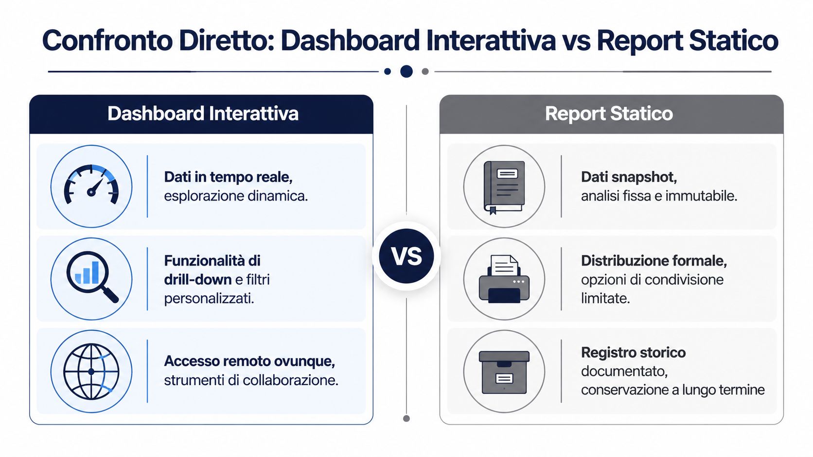
| Criterion | Interactive Dashboard | Static Report |
|---|---|---|
| Main function | Continuous monitoring and tracking of KPIs | Documentation, formal summary, archive |
| Data freshness | Frequent or real-time updates | Snapshot as of a specific date |
| User interaction | Filters, drill-downs, segmentation | Passive consultation |
| Ideal use | Operations, sales, marketing, daily oversight | Board meetings, audits, periodic closings |
| Speed of response to new inquiries | High, within the limits of the data model | Low; often requires an update |
| Fiction | More exploratory than linear | More guided and contextualized |
| Distribution | Web, shared access, remote collaboration | PDF, email, print, archive |
| Main risk | Visual overload or poorly managed KPIs | Rapid obsolescence and inflexibility |
For those working with modern BI stacks, the gap is also technical. According to this comparative analysis of BI tools, an interactive dashboard on platforms like ELECTE use WebSockets for real-time updates with an average latency of 150 ms and enable dynamic drill-downs on datasets of up to 10 million rows. Static reports, on the other hand, require manual refreshes with rendering times of 5–10 seconds and do not support on-the-fly filtering.
The first point is time. If a supply chain manager needs to quickly understand why a category is slowing down, an interactive dashboard shortens the gap between observation and verification. A static file, on the other hand, forces you to get stuck on the initial question.
The second point is autonomy. In many companies, the bottleneck isn’t a lack of data. It’s the reliance on a handful of people who know how to analyze it. Dashboards shift some of that work to business users, but only if the data model is clean.
The third factor is formality. A board of directors, an auditor, or an external partner often does not want to access a dashboard. They want a self-contained, traceable, printable document. In such cases, the report remains the preferred option.
For those who need to create formalized documents alongside dashboards, there are dedicated tools such as ELECTE's report builder.
Choosing between dashboards and reports doesn’t mean picking a clear winner. It means deciding whether you need to explore or validate at that moment.
A simple guideline can help:
This is where the debate between interactive dashboards and static reports stops being purely theoretical. It becomes a matter of work architecture.
The question that matters most to an entrepreneur isn’t which tool seems more advanced. It’s which one delivers more value, faster, with less internal friction.
In the Italian IT landscape, the picture is clear. A study by the Politecnico di Milano found that interactive dashboards increased the adoption of analytics in Italian SMEs by 45% compared to static reports, with an average ROI of 320% within 18 months. According to the same data, 68% of companies using them reduced decision-making times by 52%, as reported in the analysis cited above.
These numbers matter for one simple reason. The shorter the time between the signal and the decision, the better the company is able to course-correct before the problem escalates. In retail, this might mean responding to a stockout. In finance, it could mean catching a deviation. In sales, it means immediately identifying where the pipeline is getting clogged.
It’s not just a matter of speed. It’s a matter of the quality of internal collaboration. When teams view a shared document, they spend less time debating which file is correct and more time deciding what to do.
However, there is a common misconception. Economic returns do not automatically result from simply “setting up a dashboard.” They stem from a combination of factors:
When the dashboard reduces the time spent reading but the company does not change its decision-making process, the benefit remains limited.
In this context, the static report retains a less conspicuous but still significant economic value. It reduces ambiguity in official communications, streamlines formal procedures, and helps to ensure that decisions and outcomes are upheld over time. In other words, it safeguards the quality of governance.
That is why these two tools generate value in different ways. The interactive dashboard tends to deliver ROI through speed, adoption, and operational efficiency. The static report tends to deliver value through reliability, organizational memory, and control.
In more mature organizations, the goal isn’t to completely replace one format with another. It’s to design a process where data starts as a live signal, is interpreted within its context, and is translated into a document or action when needed.
The same company may need both tools on the same day. As roles change and the pace of work shifts, so does the most useful format.
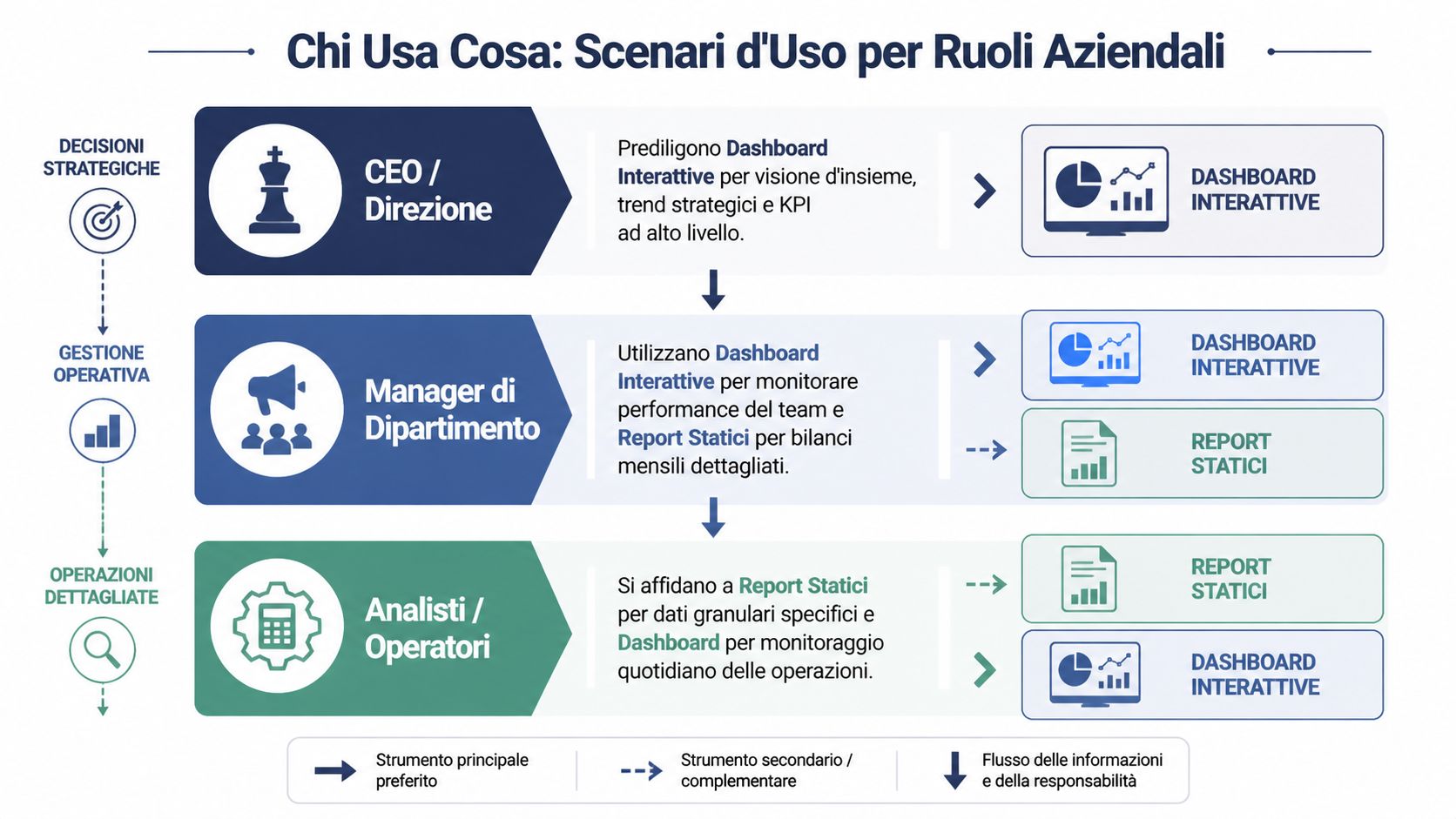
A CEO—or the head of a business unit—doesn’t need an endless spreadsheet. They need to know if they’re heading in the right direction. An interactive dashboard is often the best tool for this, as it highlights a few key strategic KPIs, trends, and variances.
The static report comes into play when that same management team needs to formalize the results. A quarterly board deck, a budget review, or a presentation to investors all require finalized figures and a well-organized narrative.
In practice, leaders use these two tools at different times:
For a retail or e-commerce manager, the benefits of dashboards are very tangible. In the Italian retail IT sector, interactive dashboards enable a 25% optimization of inventory; in the case of Zalando Italia, they helped reduce stockouts by 18% in 2023 . Furthermore, they automate 70% of the reporting process, saving €22,000 per year per team, according to the report cited in the Tableau study.
The point here isn't the visual appeal of the display. It's about being able to act quickly. A category manager can see which product lines are underperforming, filter by region, check inventory levels, and decide whether to adjust a promotion or revise the restocking plan.
For the analyst, however, the picture is more nuanced. The dashboard is used to monitor and quickly identify deviations. A static report remains useful when a detailed analysis needs to be delivered, perhaps including methodological notes, assumptions, and comments that a visualization alone does not contain.
In many organizations, the analyst doesn’t abandon the report. However, they stop using it as the sole link between the question and the answer.
A few examples will help illustrate this better:
In other words, roles aren’t divided into “dashboard people” and “report people.” They switch between different tools depending on the type of decision they need to make.
The most overlooked aspect of the comparison between interactive dashboards and static reports is the gap between identifying a problem and knowing how to address it. Many guides focus solely on the format. Few address the decision-making process.
A dashboard might flag a drop in sales in a particular region. A report might describe what happened in the last quarter. But often, neither tool, on its own, answers the most pressing question: What is the most likely cause, and what action makes sense to take now?
This is where bottlenecks arise. The manager spots the issue. Then they call the analyst. The analyst pulls up additional data. A second version is produced. Then a third. The cost isn’t just the technical time involved. It’s the disruption to the decision-making process.
The problem today isn't accessing data. It's bridging the gap between observation, interpretation, and action quickly enough.
Sources on the topic often point out that the choice depends heavily on a company’s analytical maturity and internal capabilities. For non-tech-savvy SMEs, the adoption curve and time-to-value are critical factors. Conversational analytics solutions are changing this approach, allowing users to query data without having to navigate complex dashboard interfaces, as noted in this discussion on the choice between dashboards and reports.
This perspective puts the debate back into perspective. A dashboard packed with filters can be powerful for a team that’s used to reviewing data on a daily basis. For an organization with underdeveloped governance, however, it can lead to inconsistent insights or low adoption rates.
That is why the right choice depends on some very practical questions:
AI comes into play precisely in this intermediate space. Not as an automatic substitute for human judgment, but as a tool to help link monitoring data to more accessible explanations, suggested analyses, and simpler workflows for non-specialist users.
Implementing interactive dashboards doesn’t mean launching a monolithic project that takes months to complete and is reserved solely for the IT department. For an SME, the most sensible approach is to start with a specific decision-making process and a few high-frequency business questions.

ELECTE—spelled correctly as ELECTE—is an AI-powered data analytics platform designed to make advanced features accessible even to non-specialist teams. The idea is to ensure that SMEs don’t have to choose between enterprise-level complexity and overly limited simplicity.
A realistic adoption process involves four steps:
Connect the right data sources
Not all of them at once. Start with the ones that impact the most frequent decisions: sales, inventory, finance, and business performance.
Define a few clear KPIs
An initial dashboard should clarify, not impress. It’s better to have fewer widgets and more clarity.
Determining who views what
Senior management will have strategic views. Operational managers will have more granular views. Analysts will need space to delve deeper.
Preparing to Take Action
If an anomaly arises, someone needs to know where to look further and what decision to make.
Anyone interested in seeing this approach applied in a real-world setting can request a demo of ELECTE.
The value of a platform like ELECTE lies not just in creating dashboards. It lies in its effort to bridge the gap between data visualization and decision-making. For many SMEs, this is the most challenging step, because while the data is available, its interpretation remains in the hands of only a few.
At this stage, three factors are particularly important:
If you’re really weighing interactive dashboards against static reports, the ultimate question isn’t which one you prefer. It’s which system helps your organization turn data into clearer, more widely shared, and more timely decisions.
If you want to learn how to implement this approach in your company, you can see ELECTE in action with a personalized demo. It’s a practical way to assess how interactive dashboards, automated reports, and AI-powered insights can be tailored to your team’s data maturity level—without unnecessary complexity.

.svg)
.svg)
.svg)