

You open an Excel file shared by the sales team and immediately spot the problem. The same customer appears as “Rossi Srl,” “ROSSI SRL,” “Rossi S.r.l.,” and “rossi.” At first glance, these seem like minor details. In reality, they’re the point where a reliable report starts to fall apart.
This happens often in small and medium-sized businesses. As more people enter data—each with their own style—the spreadsheet turns into a room full of different labels for the same items. Then, when you try to sum, filter, segment, or build a dashboard, you spend more time cleaning up the data than reading it. The real cost isn’t just operational. It’s the loss of trust in the analysis.
In most cases, the solution isn't a complex project. It's a very simple design choice made at the right moment: using a drop-down menu instead of leaving a field blank. If you validate the input at the source, you make the dataset more consistent, more readable, and much more useful for any subsequent analysis.
This is the true value of the drop-down menu. It’s not just a graphical detail. It’s one of the most practical ways to turn a disorganized spreadsheet into a database that supports sound decision-making.
In day-to-day work, chaos rarely comes in through the front door. It usually sneaks in through a small, unlabeled text field. One person writes “Finance,” another writes “finanza,” and yet another uses an abbreviation. After a few weeks, the sheet looks full of data. In reality, however, it contains many versions of the same information.
For anyone who manages sales, purchasing, tickets, or master data, the problem is always the same. Aggregate analyses start to yield inconsistent results, filters don’t return all the data, pivot tables multiply for no reason, and every report requires manual corrections. It’s the classic messy spreadsheet: seemingly alive, but difficult to manage.
The drop-down menu solves the problem at its core: data entry. Instead of hoping that everyone will type the same way, it requires users to select from a controlled list. It’s a small difference in the UI, but it makes a huge difference in the outcome.
Clean data doesn't start in the dashboard. It starts the moment someone fills in a cell.
That's why the drop-down menu has an impact that extends beyond Excel. When you standardize data entry, you simplify reporting, auditing, and predictive analytics. The quality of future insights often depends on this initial discipline.
In the context of computing, the Italian term “menu a tendina” corresponds to “drop-down menu” in English . The Cambridge Dictionary defines a drop-down menu as “a list of choices that appears on a computer screen and remains in place until you choose one of them.” The definition is simple, but it gets to the heart of the matter: a list of predefined choices instead of free-form input.
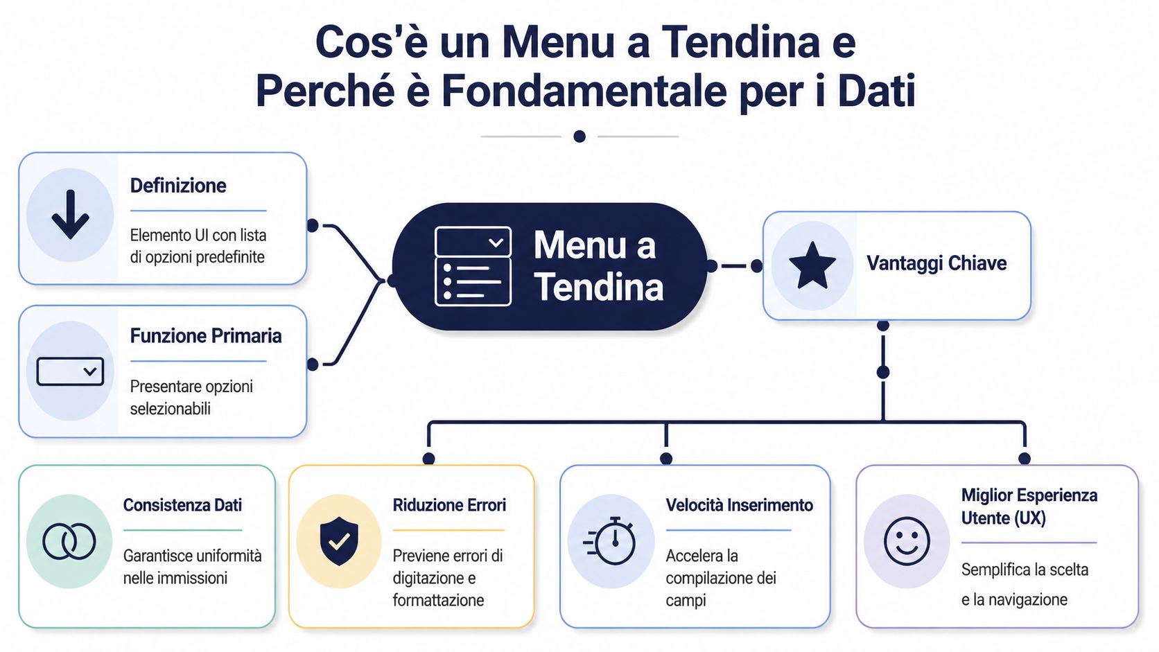
In a business context, this feature is much more than just a graphical convenience. In Excel, it is used as a data validation tool to restrict the values allowed in a cell. Basically, you first define what is acceptable and then ask the user to select it.
This approach changes the nature of the data collected. You no longer have a sequence of text variants that you need to normalize later. You have a field that is already structured, ready to be filtered, grouped, and compared.
When a team enters data without constraints, the spreadsheet accommodates differences in capitalization, abbreviations, punctuation, and working language. A drop-down menu eliminates much of this variability at the source.
The practical benefits are immediate:
Rule of thumb: If a field is intended to contain a repeatable selection, don't leave it as a free-text field.
For a company, this isn't just a matter of organization. It's a data governance decision. If you standardize the input, you reduce manual work downstream and make everything that depends on that data more stable: reporting, operational control, analysis, and forecasting.

There is no single "correct" way to use a drop-down menu. The right format depends on the type of data you want to manage, how much it changes over time, and how many options the user needs to manage.
A static menu is the simplest type. The options are fixed and almost always remain the same. This is typically the case for fields such as “Yes/No,” approval status, quarter, or month.
It works well when:
It doesn't work well when the organization grows and categories change frequently. In that case, manually entering values into the data validation becomes unreliable.
A dynamic menu links a cell to a separate data source. It’s the right solution when the list changes over time—for example, products, departments, categories, or locations. Practical guides show a clear progression from static to dynamic menus, often using named ranges and, in more advanced cases, the INDIRECT function to link selections and dependent lists. In an Italian tutorial, this approach is also applied to departments such as marketing, finance, and IT—a sign that it’s not just theory but a technique used in professional settings, as shown in the video dedicated to dynamic menus in Excel.
Another useful detail emerges in the practical guides. The examples often start with small, controlled sets—such as a sheet with 5 movies or a database with 50 entries—precisely to show how quickly a dropdown improves data entry and organization when the list is well-designed.
Here, the drop-down menu really comes into its own. The second list changes based on the first. If you select a region, you’ll see only the relevant provinces. If you select a department, you’ll see only the related cost centers. If you select a product line, only the correct subcategories will appear.
This model avoids a single, overly long list and reduces cognitive error. The user does not have to scroll through irrelevant options. They see only those that are compatible with their first choice.
A helpful summary:
| Type | When to use it | Main limitation |
|---|---|---|
| Static | Short and Stable Lists | Not very flexible |
| Dynamic | Updatable Lists | Requires a well-organized structure |
| Cascading | Hierarchical or dependent data | A more delicate configuration |
If you have to choose, start with a simple question: Should the user select from a few fixed options or from a changing taxonomy? The answer will save you a lot of trouble down the road.
A dropdown menu can either make your work easier or slower. It depends on how you design it. If the list is too long, the label is ambiguous, or the logic of the options doesn't reflect the actual process, the dropdown menu stops being a shortcut and becomes an obstacle.
The first rule is simple. A drop-down menu isn't always the best solution. If the user has to scroll through a huge list, the advantage is lost. In those cases, it's better to switch to a filterable search, an autocomplete field, or a cascading structure.

The most widely used guides often focus solely on the technical aspects of creating a dropdown menu. They do not cover operational issues and scalable alternatives as thoroughly when a simple list is no longer sufficient. This gap is also evident in the literature on the subject, where data governance over time and the most suitable solutions for complex data flows are still addressed in a fragmented manner.
In our day-to-day work, these are the practices that work best:
If a user takes too long to find an entry, you haven't made it easier to enter data. You've just shifted the problem elsewhere.
This is where accessibility comes into play in a practical way. A menu must be navigable using only a keyboard, readable by a screen reader, and unambiguously understandable. Anyone working on websites, portals, or applications should consider these aspects from the very beginning, especially in light of regulatory and practical requirements related to digital inclusion. To learn more about this topic, it’s worth reading ELECTE’s guide on widgets for digital accessibility.
Excel remains the starting point for a great many business processes. Before data is entered into an ERP, CRM, or analytics platform, it often passes through Excel first. That’s why it’s a good idea to create reliable drop-down menus right in the spreadsheet.

Microsoft provides clear instructions for creating a drop-down list in Excel: first, prepare the valid entries in a single column or row without any blank cells, then use Data > Data Validation > Allow: List in the target cell. Microsoft’s documentation also notes that using a table makes the list more robust and updatable, and that you can quickly convert it using CTRL+T, as described in the official guide for creating a drop-down list.
This best practice is even more useful than the command itself: keep your lists on a separate sheet. That way, you won't mix up the input interface with the reference data.
In practice, a reliable procedure is as follows:
Create a worksheet dedicated to the lists
. Enter the allowed values in columns, without any empty rows in between.
Convert the list into a table:
. Use CTRL+T to make the list easier to expand and manage.
Name the range:
. Instead of referring to scattered cells, give the range a clear name.
Apply data validation
. In the input cell, select Data > Data Validation > List, and link the source to the range name.
Protect the structure
If multiple people are working on the file, restrict who can edit the list sheet.
This approach is much more robust than typing the values directly into the Source box. Even an Italian guide on creating drop-down menus highlights the advantage of placing the entries in a separate worksheet and using a named range, so that maintenance remains centralized and more consistent with the practical explanation of named ranges.
In practice: Always separate the reference data from the input screen. It's the easiest way to avoid unstable menus.
If you need a ready-made template that you can adapt to your internal processes, it may be helpful to start with these Excel templates for business.
The concept remains the same whether you're working on the web or in a desktop application. In HTML, you use a selection element; in CSS, you control its presentation; and in JavaScript, you can handle dynamic or conditional logic. The rule remains the same: the source of the options must be separated from the interface, so the system can be updated without having to rewrite the form every time.
The first mistake is to think that a drop-down menu is “finished” as soon as the arrow appears in the cell. In reality, a drop-down menu only truly goes live when it begins to interact with users.
The most common feedback is always the same: “My option is missing.” The instinctive response is to add it right away. If you do that every time, the menu grows haphazardly, and within a few months it becomes just as confusing as the free-form text it was supposed to replace.
A better approach is to use feedback as a signal, not as an automatic instruction. If you include an “Other” option with a notes field, you can periodically review the values entered and determine whether any new, meaningful categories are emerging. At that point, you can update the taxonomy based on logic, not as a reaction.
This approach works because it treats the menu as a living but controlled entity. Don't focus on individual requests. Read the operational pattern.
A second, often overlooked issue concerns collaboration. Many tutorials explain how to create a dropdown menu, but devote little attention to managing lists in shared environments, data governance over time, and alternatives when the menu no longer scales well. This limitation is also evident in the general coverage of the topic, which almost always focuses on the technical creation of the menu and much less on the operational implications in discussions of the gap between creation and collaborative management.
When it comes to shared files, there are just a few rules for keeping things organized, but they’re crucial:
The dropdown menu does not replace critical thinking about the data. It simply makes it possible to apply that thinking consistently.
A well-designed menu doesn't eliminate all errors. It eliminates repetitive errors, trivial errors, and those that skew the analysis without being immediately noticeable. And that's already a huge step forward.
The quality of the analysis depends on the quality of the input data. It’s a simple rule, but one that’s often overlooked. If categories, departments, customers, or geographic areas are entered into the system in inconsistent formats, even the best analytical model will be working with flawed data.
A well-designed drop-down menu reduces unnecessary variability. This makes operations such as segmentation, aggregation, historical comparison, and pattern detection more reliable. If the same region is always recorded in the same way, you can interpret the geographic data with much greater confidence. If products follow a consistent taxonomy, you can analyze performance and product mix without having to manually correct each data extraction.

The passage reads as follows:
| Entry point | Effect on the dataset | Effect on the analysis |
|---|---|---|
| Free field | Variants, typos, duplicate categories | Less stable reports |
| Controlled drop-down menu | Standardized values | More readable and comparable insights |
When the data is clean from the start, an analytics platform can do its job more effectively. Anomalies are spotted sooner, categories are unambiguous, and reports require fewer preliminary corrections. This is also why it makes sense to invest first in the structure of the input data and then in the sophistication of the charts.
If your goal is to move from spreadsheets to more sophisticated reporting, you can learn more about how to transform data into actionable reports.
The drop-down menu may seem like just a minor interface detail. In reality, it’s a strategic control point. If you design it well, you improve data quality right from the start. If you neglect it, you’ll find yourself having to fix reports, dashboards, and analyses much later on, when the cost is higher.
The practical lesson is simple. Use drop-down lists for repetitive fields. Keep the options in a separate source. Switch to dynamic or cascading menus as complexity increases. And periodically review the taxonomy based on actual usage, not on impressions.
For many SMEs, this is the step that separates the “spreadsheet we all fill out” from the dataset you can actually use to make decisions. Clean data isn’t just more organized. It’s what makes business performance understandable, categories comparable, and insights credible.
If you want better analytics, the work doesn't start with the dashboard. It starts with a cell filled in correctly.
If you want to turn disorganized operational data into clear, actionable insights, discover ELECTE, an AI-powered data analytics platform designed to help SMEs connect data sources, automate reports, and make more informed decisions based on clean data.

.svg)
.svg)
.svg)