
Have you ever created a “clean” slide only to find that your team keeps asking for clarification because the visual message can’t carry the weight of the content? This is a common problem in small and medium-sized businesses, especially when you need to explain processes, hierarchies, or decision-making flows in a limited amount of space. In this context, “SmartArt—Microsoft” is often the first term that comes to mind, but it’s not the only possible solution. Microsoft defines SmartArt as a visual representation of information and ideas, distinct from a chart that illustrates numerical data, and the official guide outlines the Insert > SmartArt workflow for creating and editing diagrams in Office.
This guide helps you understand when SmartArt is enough, when it isn't, and how to think more broadly about smart visualizations. If you'd like to start with a broader overview of AI trends in data visualization, you can also read about the 10 key AI data visualization trends.
When you need to present a process, a roadmap, or a hierarchical structure, the point isn’t just to fit them onto a slide. The point is to make it immediately clear what matters, without asking your audience to decipher blocks of text or overly dense diagrams. For SMEs, Microsoft SmartArt serves precisely this purpose: to distinguish between a simple layout and a visualization that helps the audience follow the reasoning step by step.
Microsoft has made SmartArt a native feature of Office, accessible from the Insert menu and designed to transform text into editable diagrams. Its strength lies in its familiarity, as it allows users to get started quickly and with just a few steps. The limitation is different, because ease of use alone is not enough to solve the problem of communication.
Rule of thumb: If the content is long, complex, or changes frequently, the layout alone isn't enough. You need a visual presentation that supports reading, not one that complicates it.
In a business context, this means carefully choosing between diagrams, charts, dashboards, and hybrid formats. A SmartArt diagram can organize a process, but it isn’t always the best choice for identifying priorities, making comparisons, or tracking trends. For a useful comparison of different visual formats, you can supplement this article with ELECTE’s in-depth analyses of charts to understand which structure best conveys the data based on the decision you need to make.
The right question, then, isn’t just whether to use SmartArt. It’s whether that format truly helps decision-makers, or whether a more suitable visualization is needed—as the trends highlighted in “10 Key AI Data Visualization Trends” also suggest.
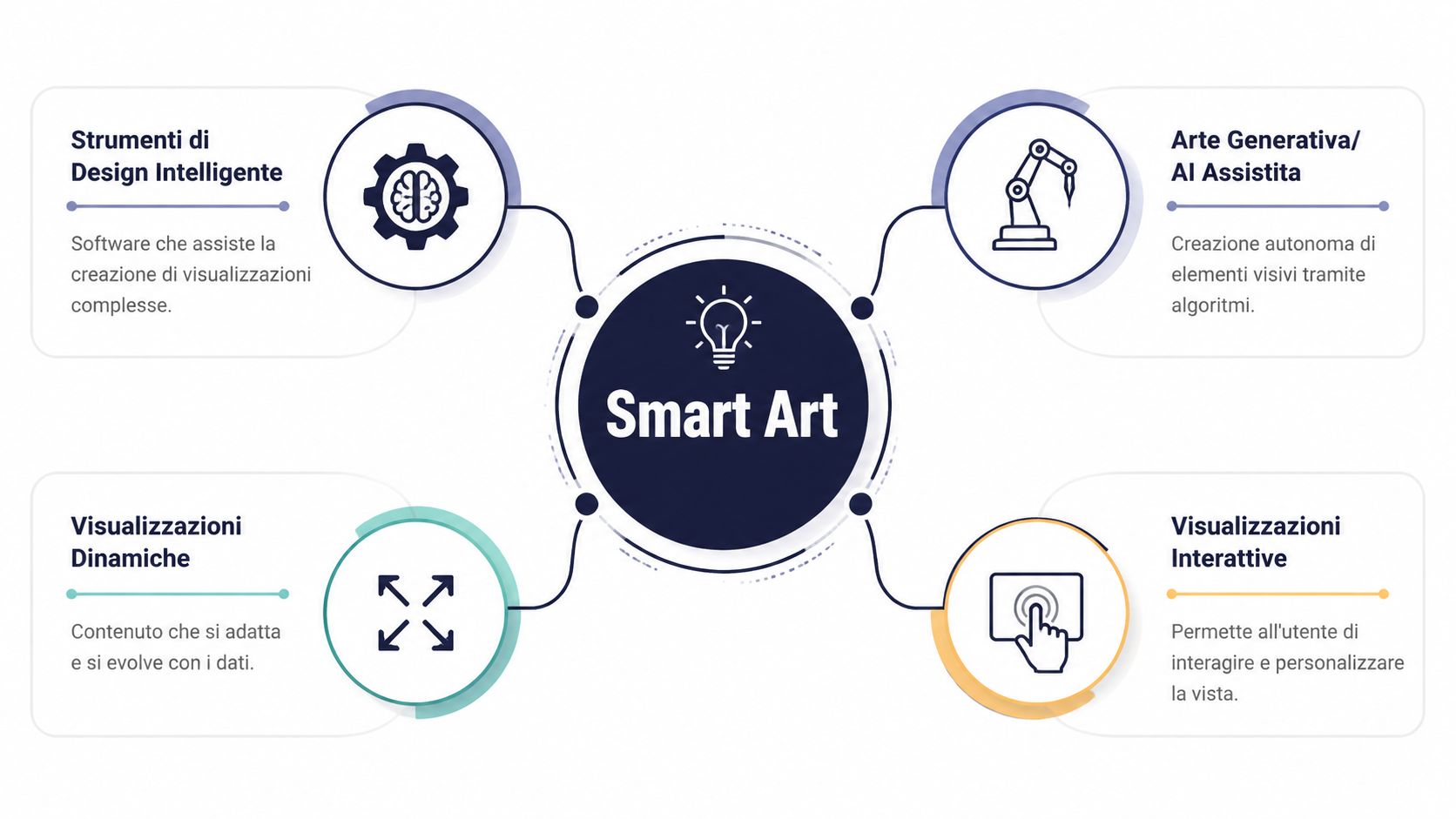
Smart art, in the broadest sense used in the company today, is not just a type of diagram. It is an approach in which intelligent design, visual rules, and automation work together to transform scattered information into a readable, up-to-date, and consistent form. The difference from a static image is simple: an intelligent visual element is not just for decoration; it serves to organize thought.
A traditional template provides a framework. SmartArt, on the other hand, aims to highlight relationships, steps, and hierarchies more clearly, even when the content changes. In a sales presentation, for example, a process flow must remain understandable even if a step is added or removed.
This is where the logicof visual adaptation comes into play. If the content evolves, the diagram should remain consistent—it shouldn’t break every time the text expands or contracts. This is the point at which many teams stop thinking of SmartArt as just an “Office object” and start treating it as a visual language.
For those working in operations, smart art is valuable because it bridges the gap between data, process, and presentation. Not everyone needs to be a designer. What’s important is that everyone understands where the key information is located.
Basically, smart art works well when you need to:
The most important thing to remember is this: Smart Art is not a graphic effect. It is a communication choice.
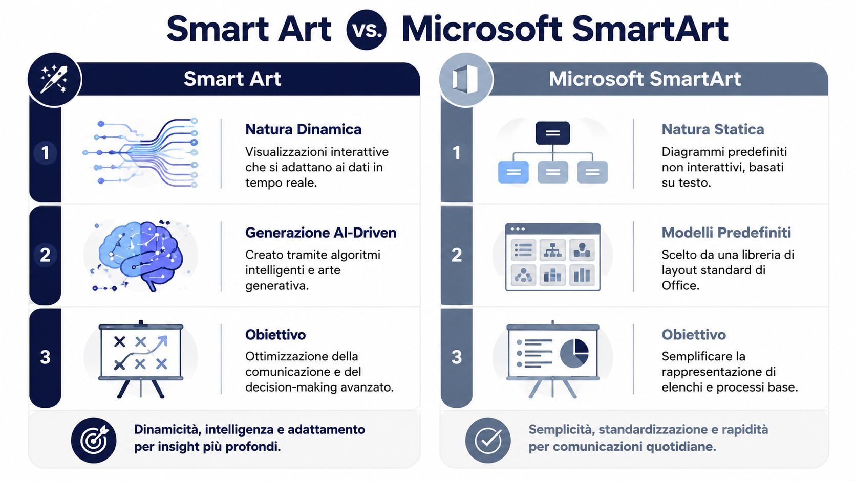
A sales manager opens a presentation and must immediately make it clear whether they are showing a sequence, a hierarchy, or a set of relationships. At that moment, the choice between Microsoft SmartArt and a more advanced form of smart art isn’t just a graphical detail—it’s a communication choice. Microsoft SmartArt is a native Office tool designed to transform text into professional diagrams, featuring predefined structures and a precise workflow ( Microsoft Support). The broader concept of “smart art,” on the other hand, focuses on visualizations that can be generated, updated, or enhanced more intelligently—especially when the content needs to adapt to the context.
SmartArt works well when the goal is to organize information that is already clear. The Italian documentation describes it as a visual representation of information and ideas—distinct from a numerical chart—and provides a simple workflow: Insert > SmartArt, with style options available in Italian on Microsoft Support.
For an operational team, the advantage is practical. You start with a list and turn it into a clear diagram without having to build each element from scratch—much like going from scattered notes to a whiteboard that’s already divided into sections. This makes it suitable for:
This limitation arises when the content grows and no longer fits a simple format. The official documentation explains clearly how to insert and edit SmartArt, but it doesn't go into much detail about a crucial consideration: knowing when it's best to avoid using it, especially if the text is long or the structure has many variations. Microsoft Support.
If you need to explain a complex system, SmartArt can be too restrictive.
Here, the difference is clearly evident. SmartArt starts with predefined templates, so it helps organize the message but tends to keep the structure within fixed limits. Smart visualizations integrated with AI platforms like ELECTE, on the other hand, can rework the content based on the data, the context, and the level of interaction required. For an SME, this means that a visualization can remain readable even when the information fields increase, change, or need to be interpreted differently by different people.
The rule of thumb is simple. Use Microsoft SmartArt when you need to clearly explain something linear, with few steps and stable relationships. Switch to more dynamic SmartVisualizations when the content isn't just meant to be displayed, but to be interpreted, updated, or linked to operational decisions.
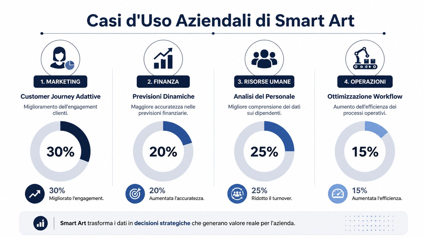
In businesses, smart art isn't just about making slides look good. It helps those who need to read, approve, or take action do their jobs better. The most compelling benefit lies in how clear visualization bridges the gap between data and decision-making.
In marketing, customer journey maps help illustrate where customers enter, pause, or re-engage with the brand. A well-designed visualization makes the transition between channels, touchpoints, and internal responsibilities immediately clear.
In finance, visual aids are useful when you need to explain scenarios, relationships, or priorities to people who don't want to read dense tables. A well-designed diagram helps organize assumptions and consequences.
In human resources, the value often lies in understanding workflows. Onboarding, roles, growth plans, and performance review processes become easier to discuss when they are presented visually and concisely.
In business operations, the key issue is process transparency. According to the Intesa Sanpaolo report, 48.9% of Italian companies citedimproved process efficiency as the main benefit of AI, with that figure reaching as high as 59.8% in the manufacturing sector.
Effective visualization reduces the time needed to explain, review, and approve. This is especially important in small and medium-sized businesses, where the same person often reads the content, discusses it, and then turns it into action.
People don't need more visual details. They need better visual details.
That's why smart art is useful in internal reports, progress meetings, and executive presentations. If the content needs to be understood by diverse teams, the quality of the design matters just as much as the quality of the analysis.
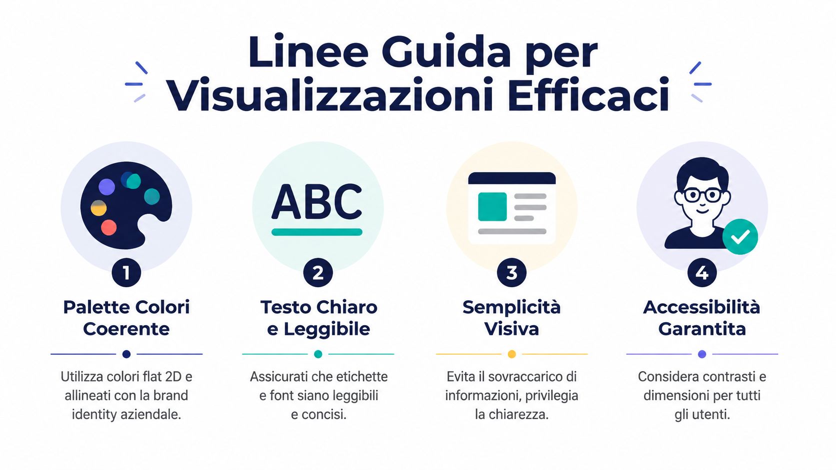
The most overlooked aspect of SmartArt—Microsoft— isn’t inserting the diagram; it’s designing the content. Microsoft shows colors, styles, and layouts, but doesn’t really delve into how to make the result readable and accessible in real-world business contexts ( Microsoft Support). For professional use, it’s best to think like someone who needs to communicate a decision, not just like someone who uses software.
If the team needs to read quickly, the first question isn't about the visual effect. It's about the function.
The first mistake is to start with aesthetics. First, you need to clarify what the visualization is meant to do: explain a process, compare elements, show a hierarchy, or summarize an idea. If the format doesn’t match the objective, even a well-organized design will fall short.
A useful guideline is simple. If the content changes frequently, you need a format that’s easy to update. If the content is mostly text-based, it’s best to condense it before turning it into a visual. If the message depends on the relationships between elements, a narrative structure works better than a flat list.
Practical sources all agree on one clear point: the text within these diagrams must remain concise. Blocks filled with long sentences immediately cause the visualization to lose its role as a reading aid.
Use short labels, strong verbs, and a clear visual hierarchy. If the audience has to read and interpret too much, the diagram no longer aids communication—it slows it down.
Readability improves when you limit unnecessary decorative elements. The same logic applies to accessibility, especially in documents distributed to diverse audiences or localized into Italian, where labels tend to take up more space.
To design effectively, keep these points in mind:
The choice of format is just as important as the graphics. Before you even ask yourself whether a chart looks good, ask yourself whether it makes it easier to decide what to do. For a comparison of chart types and their uses, you can also check out ELECTE’s in-depth articles on charts.
A good approach is to integrate the visualization into an analytics ecosystem, rather than leaving it isolated on a slide. If you link the content to the right datasets, the result is not just an image, but a gateway to information.
The growing adoption of generative AI technologies by Italian companies—which reached8.2% in 2024, representing a 163.5% increase over the previous year—demonstrates the rising popularity of InnovationPost’s more integrated visual analytics solutions. This does not mean using AI everywhere; it means making better use of these tools when updates, consistency, and speed are needed.
In practice, the best workflow is simple. Start with a clear visualization, connect it to the data that powers it, set a refresh schedule that aligns with the pace of the business, and use the output to generate reports that are easy to read even for non-technical users.
The value lies not in making the image “smart,” but in making the process that feeds it smarter.
If you work with dashboards, operational documents, or reports that change frequently, this approach saves you from having to redo everything manually each time. For a more report- and dashboard-focused approach, you can consult the guide for creating data insights, which serves as a practical reference for integrating analysis and visualizations.
"smart art - microsoft" should be interpreted on two levels. On the one hand, there is SmartArt, the native Office tool designed to present information and ideas in an organized manner. On the other hand, there is the broader concept of "smart art," which includes visualizations that are more dynamic, more adaptive, and more suited to analytical use.
The five most useful steps are as follows:
If you apply these criteria, the chart ceases to be a mere graphical aid and becomes a decision-making tool. And that’s where smart visualizations really start to make a difference for small and medium-sized businesses.
SmartArt remains useful when you need to organize text into a clear structure, especially within the Office ecosystem. It works well as a simple map: it helps organize ideas, outline steps, and make content readable that would otherwise be scattered across lists or long paragraphs. However, when the content grows, changes frequently, or requires a deeper understanding, it’s better to think in terms of smart visualizations, not just static diagrams. The key to SmartArt is understanding when a convenient tool is sufficient and when a more advanced communication system is needed.
For an SME, the most tangible benefit is the speed with which you can convey a message without making the document overly complex. Here, the decision-making criteria matter more than the visual effect. If the content is consistent and straightforward, SmartArt may suffice—much like a well-designed sign that guides without distracting. If, on the other hand, the data changes, the relationships between elements are more complex, or the document needs to support analysis and comparison, you need a visualization that remains consistent even as the content is updated. Design thoughtfully, keep the text concise, and choose visuals that truly help decision-makers. If you want to apply these principles to a broader analytical process, try ELECTE and discover how to transform your data into clearer and more useful reports.

.svg)


.svg)
.svg)



.webp)