Barplot vs Histogram: Key Differences and When to Use Each
Barplot vs histogram explained with clear examples, decision rules, and binning tips. Learn which chart fits your data and avoid common interpretation mistakes.

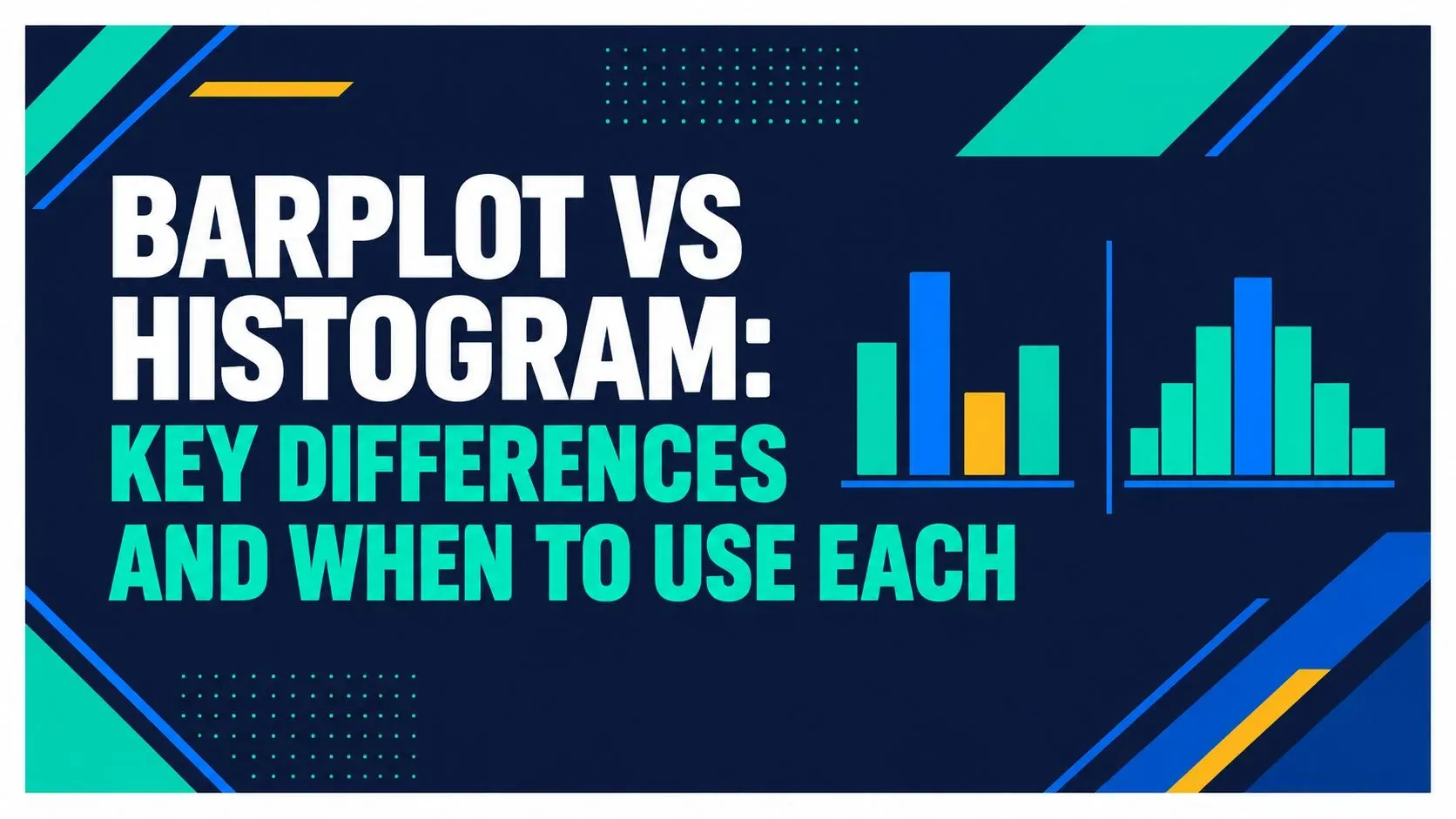
You're staring at the same sales export, but two people on your team keep telling two different stories. One looks at revenue by product category and says the problem is obvious. Another plots transaction values across the month and points to a cluster that suggests something else entirely. Both charts can be “right,” and both can be misleading if the wrong one gets the job.
That's why the barplot vs histogram choice matters. A barplot helps you compare named groups. A histogram helps you inspect how numeric values spread across a range. The tricky part is that the charts look similar enough to fool busy teams, especially when a report needs to be published fast. The skill isn't memorizing a rule. It's knowing which question you're answering, where the gray zones are, and how the chart itself can change the conclusion.
Criterion | Barplot | Histogram |
|---|---|---|
Main purpose | Compare separate categories | Show the distribution of a numeric variable |
X-axis | Category names or labels | Continuous intervals, or bins |
Bar spacing | Bars are separated | Bars touch |
Bar height | Count, percentage, mean, or another summary | Frequency, density, or proportion across bins |
Best reading habit | Compare one category to another | Read the shape, spread, and concentration |
Why Your Chart Choice Can Change the Story
A sales manager and a finance lead can look at the same dataset and reach opposite conclusions if one uses a barplot and the other uses a histogram. The manager may see product categories and ask which line is underperforming. The finance lead may see order values and ask whether the business is carrying too many low-value transactions or a handful of large ones.
That difference is not cosmetic. It changes which conversation happens in the meeting, which metric gets attention, and which action feels urgent. A barplot is built for comparing separate labels, while a histogram is built for seeing the shape of one numeric variable. If you swap them, you can end up comparing things that should never be compared, or missing the spread that explains the headline number.
A short history helps, but only as context. William Playfair is associated with early bar chart work, while later statistical graphics research helped histograms become a standard way to show continuous distributions (William Playfair's The Commercial and Political Atlas, the history of the histogram). The point is simple. These charts were built for different questions, and that difference still matters in a dashboard tool.
Practical rule: if you are asking “which group is bigger,” think barplot. If you are asking “how are the values spread,” think histogram.
Barplot and Histogram, Defined
A barplot is the right fit when each bar represents a separate named group. Revenue by product category, orders by region, and support tickets by department all belong here. The bars stay apart because the groups stay apart. You can sort them, compare them, and read the height as a count, percentage, average, or another summary value.
A histogram works differently. It takes one numeric variable, divides it into adjacent ranges, and shows how many observations fall into each range. Monthly transaction values, delivery times, and customer ages are typical examples. The bars touch because the values sit on a continuous scale, not because the chart needs to save space.
A simple example makes the difference clearer. If an SME team has 48 orders at values between 0 and 50, 31 orders between 50 and 100, and 12 orders between 100 and 150, a histogram shows the shape of those order values. If the team instead wants to compare sales across three products, a barplot shows that comparison cleanly. For a quick category-chart reference, see bar chart options, and for a practical companion on category bars, the guide to bar charts is useful.
The hard part is not the chart name. It is deciding whether the field is numeric or just numeric-looking. An order ID, invoice number, or ZIP code can contain digits and still behave like a category. If you treat those as continuous data, the histogram groups labels that should stay separate. If you need a memory aid, barplot equals separate groups, histogram equals one continuous measure broken into intervals.
The Core Differences Side by Side
A side-by-side check is useful when the labels look similar but the chart logic is different. Start with the x-axis meaning. In a barplot, each label is its own category. In a histogram, each label is a range, so the chart is grouping values instead of naming groups.
The next question is what the y-axis is showing. A barplot often uses count, percentage, average revenue, or another summary measure. A histogram usually shows frequency, or sometimes density or proportion if the software is set up that way. That is why the axis title matters more than the chart title. A reader who sees “units sold” on a barplot reads it differently from one who sees “number of orders” on a histogram.
Sorting is another practical difference. Barplots are often sorted from highest to lowest so category comparison is easy, especially in dashboards and reports. Histograms are usually ordered by numeric sequence, because the shape only makes sense from left to right. If you sort a histogram as if it were a category chart, you break the distribution.
Here is a small example from a common SME workflow. A team reviews 100 transactions. If those transactions fall into five price tiers, a barplot shows which tier is most common. If the same 100 transactions are grouped into order-value ranges, a histogram shows whether the values cluster near the low end, spread out evenly, or bunch around one middle range. The choice changes the question the chart answers.
Common software defaults can also mislead people. Many tools choose a barplot with category labels automatically, but a numeric field with digits may still be treated as continuous. That is why order IDs, invoice numbers, and ZIP codes need a check before you chart them. ELECTE's dashboard clarity framework helps here because it starts with the business question, then checks whether the chart form matches it.
Criterion | Barplot | Histogram |
|---|---|---|
Typical y-axis label | Count, %, average, or other summary | Frequency, density, or proportion |
Common default order | Often sorted by value | Ordered by numeric range |
Software behavior | Often uses category labels directly | Often bins numeric values automatically |
Reader focus | Compare named groups | Read the shape of a distribution |
Why Histograms Are Not as Objective as They Look
A histogram feels objective because it looks mathematical, but the bin width changes what people think they see. Too few bins can merge separate clusters into one smooth mound. Too many bins can make normal variation look like a pattern that matters. The chart is still valid, but the story it tells can shift.
That's why the choice is not just technical. It's a business decision. If you are looking at delivery times, transaction values, or risk scores, a different binning rule can make the data look tidy, noisy, or suspicious. People often treat the default histogram as if it were the only honest version, yet the same data can look very different depending on how the bins are set.
What different bin rules can change
Common rules such as Sturges, Scott, Rice, and Freedman-Diaconis can produce noticeably different shapes from the same dataset. One setting may suggest a single peak. Another may hint at multiple peaks or an odd gap. A human-perception study found that adding bins generally reduced viewers' errors up to a point, but the common mathematical rules often recommended more bins than people needed to read the shape effectively (histogram binning and perception).
That means you shouldn't trust a histogram just because it looks precise. If the business question is sensitive, try more than one reasonable bin width before you publish. A manager looking at claims processing times may care about a possible second cluster. A finance analyst reviewing transaction values may care about whether a few large orders are hiding in the tail.
Useful habit: if the chart drives a decision, test at least two bin widths and ask which version changes the conclusion.
The Gray-Zone Cases Most Guides Skip
The difficult cases aren't the obvious ones. They're the fields that look numeric but aren't really numeric in the way a histogram needs. A product code, postal code, or customer tier may be stored as numbers, but the digits are labels, not measurements. If you histogram them, you're pretending there's a meaningful distance between values that were never meant to be measured that way.
The reverse problem also happens. Rounded prices or ages stored as whole numbers are still quantitative variables, even though they appear discrete in the file. The question is not whether the values look tidy. The question is whether the distance between them carries real measurement meaning. If it does, a histogram may still be right, even when the data arrives in rounded form.
A simple three-question test
- Does the distance between values have real units? If the gap between 20 and 30 matters in a measurable way, you may be in histogram territory. If the numbers are only labels, use a barplot.
- Are zeros and caps genuine observations? If a zero means “none” and a cap means “maximum allowed,” that affects interpretation. If they're placeholders or codes, don't treat them as distribution data.
- Is the goal category comparison or distribution diagnosis? If you want to compare named groups, pick a barplot. If you want to inspect spread, skew, or clusters, pick a histogram.
Many dashboards go wrong by treating numeric encodings as measurements. A survey rating stored as 1 to 5 may be ordinal, not continuous. A customer tier encoded as 1, 2, 3 is still a category, not a measurement scale. The chart should reflect the business meaning, not the file format. For a more checklist-style view of these pitfalls, the quiz on gray-zone chart selection covers the same conceptual trap from a data-meaning angle.
Three Real Use Cases From an SME Day
A retailer wants to compare sales by clothing, electronics, and groceries. That's a barplot problem, because the team is comparing separate categories, not measuring a distribution. The chart answers which line is strongest and which deserves a promotion review. It helps the team decide where to shift inventory or campaign attention.
A logistics lead wants to inspect delivery times. That's a histogram problem, because the team needs to see whether most shipments cluster in one range or whether there's a long tail of late deliveries. The chart can reveal whether the service issue is broad or isolated. That changes whether the next action is process tuning or exception handling.
A finance analyst wants to compare average revenue by customer tier. That's back to a barplot, because the tiers are labels and the question is comparative. The chart makes it easier to see whether premium customers are materially different from standard customers and to discuss pricing, retention, or upsell strategy.
If you want a tool that can help non-technical teams choose between those views, ELECTE can recommend a bar chart for discrete categories and a histogram for continuous numeric values. It's useful when people need a quick report without turning chart selection into a manual debate.
If you're mapping these decisions to business workflows, browse quantitative testing strategies for designers is a helpful reference for thinking about how data visualizations support decisions, not just presentation.
How to Choose, Draw, and Verify Your Chart
Start with the variable. If it's a named group, choose a barplot. If it's a numeric measure you want to inspect across ranges, choose a histogram. Then label the y-axis, because identical-looking bars can mean counts, percentages, means, or another summary, and the chart should never leave that ambiguous.
For histograms, check the bin width before you share the chart. If the shape changes your conclusion, you haven't finished the analysis yet. If the shape is stable across reasonable widths, you can present it with more confidence.
A quick final verification helps too. Ask, “Would the story still make sense if I re-sorted the bars?” If yes, you probably have a barplot. If no, and the order matters, you probably have a histogram. If you want to test that logic with a simple tool, try ELECTE's histogram generator as a quick check before you publish.
Final check: chart type, y-axis label, and business question should all say the same thing.
Key Takeaways and Your Next Chart
Use the variable type first, not the chart that looks familiar. Watch for the gray zone of numeric-looking labels. Test more than one bin width if the histogram will drive a decision. Label the y-axis precisely. Verify that the chart still answers the business question you started with.
That's the barplot vs histogram lesson. The chart is not decoration. It's part of the decision. When your team gets that right, reports get clearer and meetings get shorter.
ELECTE helps teams turn raw business data into clear visuals and automated insights, including chart selection that matches the variable type. If you want your reporting to handle barplot vs histogram decisions more reliably, visit ELECTE and see how the platform supports faster, clearer analysis.
Comments
No comments yet — start the conversation.